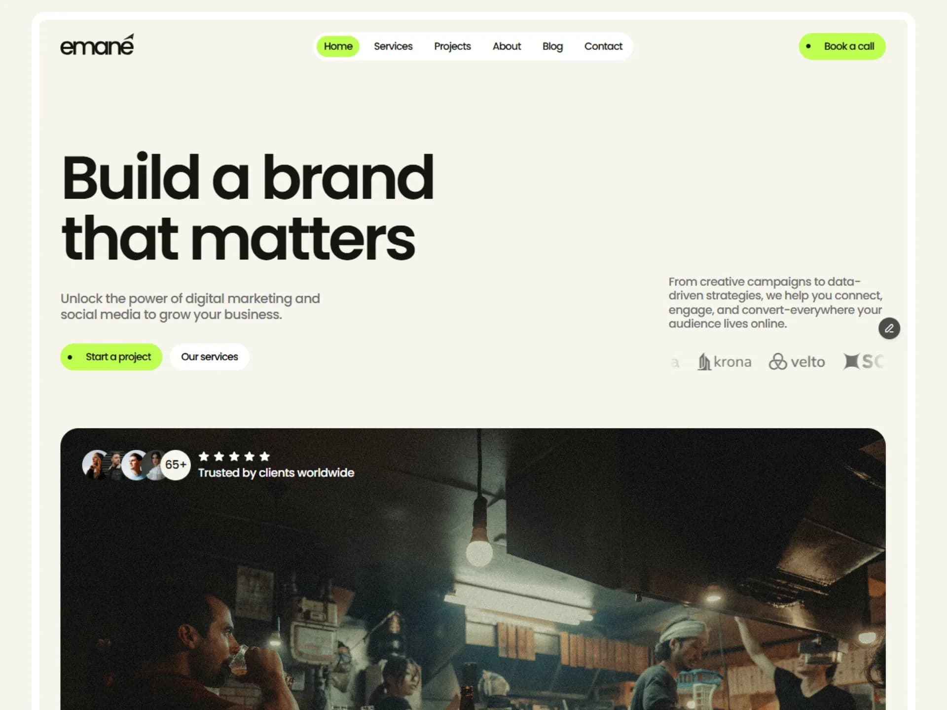
Accordion List
Divided rows that open by height; closed rows dim until hovered.
From the Nitip template — see it in contextPositioning, audience research and a clear voice, so every page speaks to the right people.
Layouts, type and motion designed together, tested at every screen size before a line of code.
Fast, accessible sites built on Next.js, with content your team can edit without a developer.
import { AccordionList } from "@/components/ui/accordion-list";

const items = [
  {
    value: "strategy",
    marker: "01",
    title: "Brand strategy",
    content: "Positioning, audience research and a clear voice, so every page speaks to the right people.",
  },
  {
    value: "design",
    marker: "02",
    title: "Web design",
    content: "Layouts, type and motion designed together, tested at every screen size before a line of code.",
  },
  {
    value: "development",
    marker: "03",
    title: "Development",
    content: "Fast, accessible sites built on Next.js, with content your team can edit without a developer.",
  },
];

export default function AccordionListDemo() {
  return <AccordionList items={items} defaultValue={["strategy"]} className="max-w-md" />;
}
Installation
$ npx shadcn@latest add https://framebrick.co/r/accordion-list.json1. Install the dependencies.
npm install motion clsx tailwind-merge2. Add
cn()tolib/utils.ts(skip if shadcn already created it).import { clsx, type ClassValue } from "clsx"; import { extendTailwindMerge } from "tailwind-merge"; /* tailwind-merge must know the site's type scale (globals.css) is a font size, not a text color — otherwise cn("text-h6 text-muted-foreground") drops text-h6. */ const twMerge = extendTailwindMerge({ extend: { classGroups: { "font-size": [{ text: ["display", "h1", "h2", "h3", "h4", "h5", "h6"] }] } }, }); export function cn(...inputs: ClassValue[]) { return twMerge(clsx(inputs)); }3. Copy the component into
components/ui/accordion-list.tsx."use client"; import * as React from "react"; import { motion, type Transition } from "motion/react"; import { cn } from "@/lib/utils"; /* * Accordion List — shadcn-style divided rows that open by height (from the Nitip service and careers lists). * Closed rows sit at 50% opacity and return to full on hover; the plus turns into a cross when open. * Closed panels stay in the HTML (good for search engines) but are inert, so keyboards and screen readers skip them. */ const soft: Transition = { type: "spring", bounce: 0, duration: 0.4 }; export type AccordionListItem = { value: string; title: React.ReactNode; content: React.ReactNode; /** Shown before the title from 640px up: a number, a dot, an icon. */ marker?: React.ReactNode; }; export type AccordionListProps = { items: AccordionListItem[]; /** "single" closes the open row when another opens. */ type?: "single" | "multiple"; defaultValue?: string[]; value?: string[]; onValueChange?: (value: string[]) => void; /** Dim closed rows to 50%. */ dim?: boolean; className?: string; }; export function AccordionList({ items, type = "single", defaultValue = [], value, onValueChange, dim = true, className, }: AccordionListProps) { const [internal, setInternal] = React.useState<string[]>(defaultValue); const open = value ?? internal; const id = React.useId(); function toggle(item: string) { const isOpen = open.includes(item); const next = isOpen ? open.filter((v) => v !== item) : type === "single" ? [item] : [...open, item]; if (value === undefined) setInternal(next); onValueChange?.(next); } return ( <div className={cn("w-full", className)}> {items.map((item) => { const isOpen = open.includes(item.value); const panelId = `${id}-${item.value}-panel`; const triggerId = `${id}-${item.value}-trigger`; return ( <div key={item.value} className={cn( "border-b transition-opacity duration-400 ease-out last:border-b-0", dim && !isOpen && "opacity-50 hover:opacity-100 has-focus-visible:opacity-100", )} > <h3> <button id={triggerId} type="button" aria-expanded={isOpen} aria-controls={panelId} onClick={() => toggle(item.value)} className="flex w-full cursor-pointer items-center gap-4 rounded-md py-4 text-left text-sm font-medium outline-none focus-visible:border-ring focus-visible:ring-[3px] focus-visible:ring-ring/50" > {item.marker && ( <span className="hidden w-8 shrink-0 text-muted-foreground tabular-nums sm:flex">{item.marker}</span> )} <span className="flex-1">{item.title}</span> <motion.svg aria-hidden viewBox="0 0 24 24" fill="none" stroke="currentColor" strokeWidth={2} strokeLinecap="round" className="size-4 shrink-0 text-muted-foreground" initial={false} animate={{ rotate: isOpen ? 45 : 0 }} transition={soft} > <path d="M12 4v16M4 12h16" /> </motion.svg> </button> </h3> <motion.div id={panelId} role="region" aria-labelledby={triggerId} inert={!isOpen} initial={false} animate={isOpen ? "open" : "closed"} variants={{ open: { height: "auto", opacity: 1, transition: { height: soft, opacity: { duration: 0.25, delay: 0.1 } } }, closed: { height: 0, opacity: 0, transition: { height: soft, opacity: { duration: 0.15 } } }, }} className="overflow-hidden" > <div className={cn("pb-4 text-sm text-muted-foreground", item.marker && "sm:pl-12")}>{item.content}</div> </motion.div> </div> ); })} </div> ); }
Usage
import { AccordionList } from "@/components/ui/accordion-list";

<AccordionList
  defaultValue={["design"]}
  items={[
    { value: "design", marker: "01", title: "Web design", content: "…" },
    { value: "build", marker: "02", title: "Development", content: "…" },
  ]}
/>
Props
| Prop | Type | Default | Description |
|---|---|---|---|
| items | { value, title, content, marker? }[] | — | Rows. The marker (number, dot, icon) shows from 640 px up. |
| type | "single" | "multiple" | "single" | Single closes the open row when another opens. |
| value | string[] | — | Open rows (controlled). |
| defaultValue | string[] | [] | Initially open rows (uncontrolled). |
| onValueChange | (value: string[]) => void | — | Called when rows open or close. |
| dim | boolean | true | Closed rows sit at 50% opacity until hovered. |
- Closed panels stay in the HTML (search engines read them) but are inert, so keyboards and screen readers skip them.
AI prompt
Paste into v0, Lovable, Bolt or Claude to rebuild this component in your own project.
Create a React + Tailwind CSS + Motion (motion/react) component called AccordionList.
- Proportions of the shadcn/ui Accordion: rows with border-b (none on the last), trigger py-4 text-sm font-medium.
- Each row: a full-width button with an optional marker (muted, tabular numbers, hidden under 640px), the title and a
  16px muted plus icon.
  Open: the plus rotates 45° into a cross (spring, no bounce, 0.4s).
- The panel animates height 0 → auto with the same spring; its opacity fades in 0.25s after a 0.1s delay and fades out in 0.15s.
- Closed rows are 50% opacity and return to 100% on hover or keyboard focus (0.4s ease-out).
- Props: items {value,title,content,marker?}[], type single|multiple, value/defaultValue/onValueChange (string[]), dim.
- Accessibility: aria-expanded / aria-controls on the button, role region + aria-labelledby on the panel,
  closed panels stay rendered but inert.