Index List
A list of names where pointing at one chooses it, the rest step back and its panel shows beside the list.
$npx shadcn@latest add https://framebrick.co/r/index-list.jsonFrom the Tustel template, see it in context.
Positioning, audience research and a voice your team can actually keep to.
Layouts, type and motion designed together and tested at every screen size.

Fast, accessible sites on Next.js, with content your team edits without a developer.

import { IndexList } from "@/components/ui/index-list";

// Demo photos from Unsplash (free under the Unsplash License), served by this site so no request leaves it.
const services = [
  {
    value: "strategy",
    title: "Brand strategy",
    summary: "Positioning, audience research and a voice your team can actually keep to.",
    image: "/demo/media-accordion-strategy.webp",
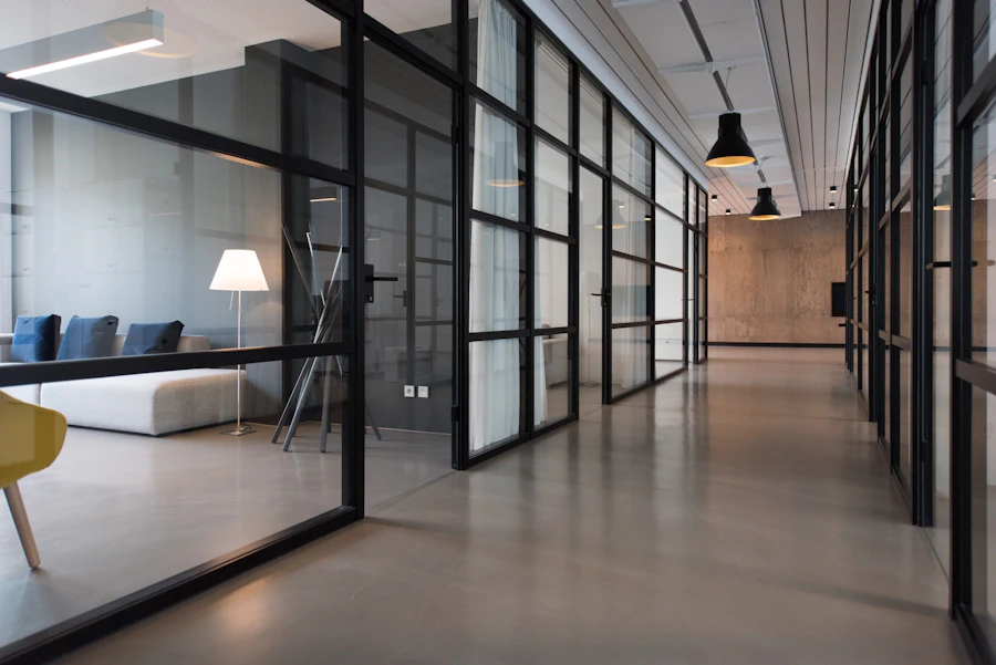
    alt: "Glass-walled office corridor with a sofa and a floor lamp",
  },
  {
    value: "design",
    title: "Web design",
    summary: "Layouts, type and motion designed together and tested at every screen size.",
    image: "/demo/media-accordion-design.webp",
    alt: "Glass towers seen from the street, looking up",
  },
  {
    value: "build",
    title: "Development",
    summary: "Fast, accessible sites on Next.js, with content your team edits without a developer.",
    image: "/demo/media-accordion-build.webp",
    alt: "Open-plan office with rows of people working at laptops",
  },
];

export default function IndexListDemo() {
  return (
    <IndexList
      label="Services"
      className="max-w-3xl"
      items={services.map((service, index) => ({
        value: service.value,
        marker: String(index + 1).padStart(2, "0"),
        title: service.title,
        panel: (
          <div className="flex flex-col gap-4">
            <p>{service.summary}</p>
            <img src={service.image} alt={service.alt} className="aspect-[3/2] w-full rounded-md object-cover" />
          </div>
        ),
      }))}
    />
  );
}
Installation
$ npx shadcn@latest add https://framebrick.co/r/index-list.json1. Install the dependencies.
npm install motion clsx tailwind-merge2. Add
cn()tolib/utils.ts(skip if shadcn already created it).import { clsx, type ClassValue } from "clsx"; import { extendTailwindMerge } from "tailwind-merge"; /* tailwind-merge must know the site's type scale (globals.css) is a font size, not a text color — otherwise cn("text-h6 text-muted-foreground") drops text-h6. */ const twMerge = extendTailwindMerge({ extend: { classGroups: { "font-size": [{ text: ["display", "h1", "h2", "h3", "h4", "h5", "h6"] }] } }, }); export function cn(...inputs: ClassValue[]) { return twMerge(clsx(inputs)); }3. Copy the component into
components/ui/index-list.tsx."use client"; import * as React from "react"; import { motion, useReducedMotion, type Transition } from "motion/react"; import { cn } from "@/lib/utils"; /* * Index List — a list of names where one is chosen and the rest step back; what belongs to the chosen one shows beside * the list, or under its name when there is little room (from the Tustel Services and the Portfolio "List" view). * Pointing at a name chooses it and it stays chosen when the pointer leaves; a click or Enter chooses it too, on any * device. There is always one chosen name. * * Framer's spring for the names and the narrow accordion: bounce 0.2, 0.4s (a slight overshoot). When the panel is * beside the list it changes at once, with no cross-fade, as in Tustel; otherwise the chosen name opens its panel under * it by height. * * The layout follows the width of the list, not of the window (a container query, 576px): Tustel's breakpoints are * the window's, which broke as soon as the list sat in a sidebar or a card. Each panel is in the page once, inside its * own list item. When there is room the list becomes a grid and every panel is placed in the same cell beside the * names, so the content is not duplicated for the two layouts (a copy would repeat ids and state). The names space out * if a panel is taller than the list. * * Improvement over Tustel: its names fall to 30% opacity, which is 2.1:1 against white; the library steps them back to * 65% (6.3:1 in the default theme, 8:1 in dark, and 5.1:1 or better in all four Blocks sample themes, light and dark; 60% * was 4.4 in "soft"). Its accent colour on the chosen name is left out — callers colour it * with `aria-expanded:` classes through `nameClassName`. Reduced motion is a zero-duration transition (opacity and * height are not transforms, so MotionConfig would not skip them); the markup never depends on it. */ const soft: Transition = { type: "spring", bounce: 0.2, duration: 0.4 }; export type IndexListItem = { value: string; /** The name: large text, one line. */ title: React.ReactNode; /** Before the name: a number, say. */ marker?: React.ReactNode; /** What shows while this name is chosen: beside the list when it is at least 576px wide, under the name below. */ panel: React.ReactNode; }; export type IndexListProps = { items: IndexListItem[]; value?: string; /** The name that starts chosen; the first by default. */ defaultValue?: string; onValueChange?: (value: string) => void; /** Accessible name of the list. */ label: string; /** "hover": pointing at a name with a mouse chooses it, while the panel is beside the list. "click": only a click or Enter does. */ trigger?: "hover" | "click"; /** Opacity of the names that are not chosen. */ dimmed?: number; /** Width of the panel when it is beside the list, in px (never more than 55% of the list). */ panelWidth?: number; /** Classes for every name button; the chosen one has aria-expanded="true". */ nameClassName?: string; className?: string; }; export function IndexList({ items, value, defaultValue, onValueChange, label, trigger = "hover", dimmed = 0.65, panelWidth = 360, nameClassName, className, }: IndexListProps) { const [internal, setInternal] = React.useState(defaultValue ?? items[0]?.value); const active = value ?? internal; const reduce = Boolean(useReducedMotion()); const list = React.useRef<HTMLUListElement>(null); const id = React.useId(); const transition = reduce ? { duration: 0 } : soft; function choose(next: string) { if (next === active) return; if (value === undefined) setInternal(next); onValueChange?.(next); } /* Whether the panel is beside the list is CSS (a container query), so ask the list, when the pointer arrives and never while rendering: the server cannot know it. */ function point(event: React.PointerEvent, next: string) { if (trigger !== "hover" || event.pointerType !== "mouse" || !list.current || getComputedStyle(list.current).display !== "grid") return; choose(next); } return ( <div className={cn("@container w-full", className)}> <ul ref={list} aria-label={label} style={{ ["--index-panel" as string]: `${panelWidth}px`, ["--index-rows" as string]: items.length }} className="flex w-full flex-col gap-6 @xl:grid @xl:grid-cols-[minmax(0,1fr)_minmax(0,min(var(--index-panel),55%))] @xl:gap-x-12" > {items.map((item, index) => { const open = item.value === active; const buttonId = `${id}-${index}-name`; const panelId = `${id}-${index}-panel`; return ( <li key={item.value} className="flex flex-col @xl:contents"> <motion.button id={buttonId} type="button" aria-expanded={open} aria-controls={panelId} onClick={() => choose(item.value)} onPointerEnter={(event) => point(event, item.value)} initial={false} animate={{ opacity: open ? 1 : dimmed }} transition={transition} className={cn( "cursor-pointer self-start rounded-md text-left text-2xl font-semibold tracking-tight outline-none focus-visible:ring-[3px] focus-visible:ring-ring/50 @xl:col-start-1 @xl:text-3xl", nameClassName, )} > {item.marker && <span className="mr-3 font-normal tabular-nums">{item.marker}</span>} {item.title} </motion.button> {/* Narrow: the panel opens under its name by height. Wide: only the chosen one shows, in the shared cell. */} <motion.div id={panelId} role="region" aria-labelledby={buttonId} data-state={open ? "open" : "closed"} inert={!open} initial={false} animate={{ height: open ? "auto" : 0 }} transition={transition} style={{ gridRow: "1 / span var(--index-rows)" }} className="overflow-hidden @xl:col-start-2 @xl:h-auto! @xl:self-center @xl:overflow-visible @xl:data-[state=closed]:hidden" > <div className="pt-4 text-sm text-muted-foreground @xl:pt-0">{item.panel}</div> </motion.div> </li> ); })} </ul> </div> ); }
Usage
import { IndexList } from "@/components/ui/index-list";

<IndexList
  label="Services"
  nameClassName="aria-expanded:text-orange-600"   // colour the chosen name through its aria-expanded state
  items={services.map((s, i) => ({
    value: s.slug,
    marker: String(i + 1).padStart(2, "0"),
    title: s.name,
    panel: (
      <>
        <p>{s.summary}</p>
        <Image src={s.photo} alt="" width={300} height={200} />
      </>
    ),
  }))}
/>
Props
| Prop | Type | Default | Description |
|---|---|---|---|
| items | { value, title, marker?, panel }[] | — | The names. `panel` is what shows while the name is chosen: beside the list when it is wide enough, under the name when it is not. |
| label | string | — | Accessible name of the list. |
| value | string | — | Chosen name (controlled). |
| defaultValue | string | first item | Name that starts chosen (uncontrolled). |
| onValueChange | (value: string) => void | — | Called when another name is chosen. |
| trigger | "hover" | "click" | "hover" | Whether pointing at a name with a mouse chooses it, while the panel is beside the list. A click or Enter always does. |
| dimmed | number | 0.65 | Opacity of the names that are not chosen. |
| panelWidth | number | 360 | Width of the panel when it is beside the list, in px — never more than 55% of the list. |
| nameClassName | string | — | Classes for every name button. The chosen one has aria-expanded="true", so `aria-expanded:` utilities colour it. |
| className | string | — | Classes for the list. |
- One name is always chosen. Pointing at a name chooses it and it stays chosen when the pointer leaves; a click or Enter chooses it on any device. When the list is under 576 px wide the panel opens under its name by height, and a click on the open name leaves it open.
- The layout follows the width of the list, not of the window (a container query at 576 px), so it works in a sidebar or a card; Tustel's breakpoints are the window's and broke there. Each panel is in the page once, inside its own list item. When there is room the list becomes a grid and every panel sits in the same cell beside the names, so the content is not duplicated for the two layouts (a copy would repeat ids and state). The names space out if a panel is taller than the list.
- Pointing only counts for a mouse, and while the panel is beside the list; touch and keyboard use a click or Enter. Whether it is beside the list is read from the list's computed display when the pointer arrives, never while rendering.
- Tustel dims the other names to 30%, which is 2.1:1 against white. The library steps them back to 65%: 6.3:1 in the default theme, 8:1 in dark, and 5.1:1 or better in all four Blocks sample themes, light and dark (60% was 4.4 in the "soft" theme). Tustel's orange on the chosen name is left out — colour it with `nameClassName`.
- The names and the phone accordion use Framer's springSoft (bounce 0.2, 0.4 s); the panel beside the list changes at once, with no cross-fade, as in Tustel. Reduced motion is a zero-duration transition, not different markup.
AI prompt
Paste into v0, Lovable, Bolt or Claude to rebuild this component in your own project.
Create a React + Tailwind CSS + Motion (motion/react) component called IndexList.
- Wrap everything in a div with the @container class (a container query, so the layout follows the list's own width). Inside
  it, a ul with an aria-label: flex column with gap-6; from the @xl container size (576px) a grid with columns minmax(0,1fr)
  and minmax(0,min(var(--index-panel),55%)) (the panel width, default 360px) and gap-x-12. Each li is flex column and, from
  @xl, display: contents, so its name and its panel become grid items of the ul.
- Each name is a motion.button: type button, aria-expanded, aria-controls its panel, text-2xl font-semibold
  tracking-tight (text-3xl from @xl), left-aligned, rounded-md, ring-[3px] ring-ring/50 on focus-visible; an optional
  marker (tabular-nums) comes before the title. It sits in grid column 1. Exactly one name is chosen (the first by
  default); the chosen name animates to opacity 1 and the rest to 0.65 with a spring (bounce 0.2, duration 0.4s).
  Controlled (value, onValueChange) or uncontrolled (defaultValue).
- A click or Enter chooses a name. With trigger="hover", onPointerEnter chooses it too, only for pointerType "mouse" and
  only when the ul's computed display is grid (the panel is beside the list) — read it inside the handler, never while rendering. The chosen name
  stays chosen when the pointer leaves.
- Each panel is a motion.div with role region, aria-labelledby its name, inert while closed and a data-state attribute.
  Narrow, it has overflow hidden and animates height between 0 and auto with the same spring, so the chosen name opens
  under itself and a click on the open one leaves it open. From @xl it is placed in grid column 2 and row 1 spanning all
  rows (inline gridRow: "1 / span var(--index-rows)", the row count set on the ul), centred vertically, with height:auto
  forced (md:h-auto!) and overflow visible; a closed panel is display: none. No cross-fade: the panel changes at once.
- Use useReducedMotion() only to switch the transitions to zero duration — never to change the markup. Ids come from
  useId and the index.