Frame Card
A photo card whose sharp photo shrinks inside a blurred copy of itself on hover, while the title rolls up.
$npx shadcn@latest add https://framebrick.co/r/frame-card.jsonFrom the Tustel template, see it in context.

import { FrameCard } from "@/components/ui/frame-card";

// Demo photos from Unsplash (free under the Unsplash License), served by this site so no request leaves it.
const projects = [
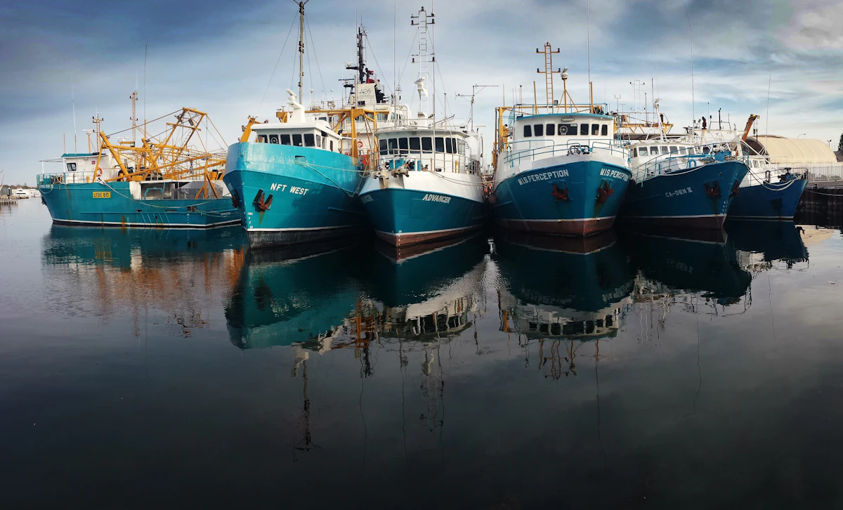
  { title: "Harbour Light", meta: "Editorial photography", image: "/demo/slideshow-harbour.webp", ratio: "3 / 4" },
  { title: "Kestrel", meta: "Product launch", image: "/demo/zoom-card-kestrel.webp", ratio: "4 / 3" },
  { title: "Mistfield", meta: "Brand identity", image: "/demo/parallax-hills.webp", ratio: "1 / 1" },
];

export default function FrameCardDemo() {
  return (
    <div className="grid w-full max-w-2xl items-start gap-5 sm:grid-cols-3">
      {projects.map((project) => (
        <FrameCard
          key={project.title}
          href="#"
          title={project.title}
          meta={project.meta}
          ratio={project.ratio}
          media={<img src={project.image} alt="" />}
        />
      ))}
    </div>
  );
}
Installation
$ npx shadcn@latest add https://framebrick.co/r/frame-card.json1. Install the dependencies.
npm install motion clsx tailwind-merge2. Add
cn()tolib/utils.ts(skip if shadcn already created it).import { clsx, type ClassValue } from "clsx"; import { extendTailwindMerge } from "tailwind-merge"; /* tailwind-merge must know the site's type scale (globals.css) is a font size, not a text color — otherwise cn("text-h6 text-muted-foreground") drops text-h6. */ const twMerge = extendTailwindMerge({ extend: { classGroups: { "font-size": [{ text: ["display", "h1", "h2", "h3", "h4", "h5", "h6"] }] } }, }); export function cn(...inputs: ClassValue[]) { return twMerge(clsx(inputs)); }3. Copy the component into
components/ui/frame-card.tsx.import * as React from "react"; import Link from "next/link"; import { cn } from "@/lib/utils"; /* * Frame Card — a photo card where pointing at it shrinks the sharp photo to 85% of the width inside a blurred copy of * itself, so the copy shows as a frame, while the title rolls up to a second copy of itself (from the Tustel project * cards). Under the photo, a row: the title at the left, a small line of text at the right. * * It is plain CSS — no animation library, no JavaScript — and works as it is on a server page. Framer's spring (bounce * 0, 0.5s) is approximated by cubic-bezier(0.22, 1, 0.36, 1) over 500ms, the curve a critically damped spring has; with * reduced motion the hover state simply changes. Keyboard focus shows the same state as hover. * * The photo is passed once and drawn twice (a sharp one and the blurred frame), so give it an image: a video would be * decoded twice. The blurred copy is aria-hidden and the photo is decorative (alt=""): the link is named by the title. * Improvements over Tustel: the blurred copy is scaled up 4% so the blur does not fade out at the edge of the box, and * the photo has the library's rounded corners. Tustel's orange second title is left to the caller (`rollClassName`): * the library ships no accent colour. */ const ease = "duration-500 ease-[cubic-bezier(0.22,1,0.36,1)] motion-reduce:transition-none"; export type FrameCardProps = { /** The photo, drawn twice: sharp, and blurred behind it. Give it an empty alt text; `fill` and plain img both work. */ media: React.ReactNode; /** Shown twice: the second copy rolls into view on hover. Plain text or inline content. */ title: string; /** A small line at the right of the title row, e.g. the category. */ meta?: React.ReactNode; /** Makes the whole card a link (Next.js Link; a full address opens in a new tab). */ href?: string; /** Proportions of the photo box, as a CSS aspect-ratio value: "4 / 3", "367 / 550". */ ratio?: string; /** How wide the sharp photo is on hover, as a share of the card. */ shrink?: number; /** Classes for the second copy of the title — a colour, say. */ rollClassName?: string; className?: string; }; export function FrameCard({ media, title, meta, href, ratio = "4 / 3", shrink = 0.85, rollClassName, className }: FrameCardProps) { const classes = cn( "group flex flex-col gap-2.5 rounded-lg outline-none focus-visible:ring-[3px] focus-visible:ring-ring/50", className, ); const style = { ["--frame-shrink" as string]: `${shrink * 100}%` }; const content = ( <> <span className="relative block w-full overflow-hidden rounded-lg bg-muted" style={{ aspectRatio: ratio }}> <span aria-hidden className="absolute inset-0 scale-[1.04] blur-[3px] [&>*]:size-full [&>*]:object-cover"> {media} </span> <span className={cn( "absolute top-1/2 left-1/2 block w-full -translate-x-1/2 -translate-y-1/2 overflow-hidden rounded-lg transition-[width] [&>*]:size-full [&>*]:object-cover", "group-hover:w-(--frame-shrink) group-focus-visible:w-(--frame-shrink)", ease, )} style={{ aspectRatio: ratio }} > {media} </span> </span> <span className="flex flex-wrap items-end justify-between gap-x-2.5"> {/* The first copy sizes the box and names the link; the two that roll are hidden from assistive technology. The title stays on one line, so in a narrow card the small text drops under it instead of squeezing it. */} <span className="relative flex max-w-full flex-col overflow-hidden text-base font-medium whitespace-nowrap"> <span className="opacity-0">{title}</span> <span aria-hidden className={cn( "absolute top-0 left-0 flex flex-col whitespace-nowrap transition-transform group-hover:-translate-y-1/2 group-focus-visible:-translate-y-1/2", ease, )} > <span className="pb-2.5">{title}</span> <span className={cn("pb-2.5", rollClassName)}>{title}</span> </span> </span> {meta && <span className="ml-auto shrink-0 text-sm text-muted-foreground">{meta}</span>} </span> </> ); if (!href) { return ( <div className={classes} style={style}> {content} </div> ); } if (/^https?:\/\//.test(href)) { return ( <a href={href} target="_blank" rel="noopener noreferrer" className={classes} style={style}> {content} </a> ); } return ( <Link href={href} className={classes} style={style}> {content} </Link> ); }
Usage
import { FrameCard } from "@/components/ui/frame-card";

<FrameCard
  href="/work/aurora"
  title="Aurora Coffee"
  meta="Brand photography"
  ratio="3 / 4"
  rollClassName="text-orange-600"
  media={<Image src={cover} alt="" fill sizes="(min-width: 1024px) 33vw, 100vw" />}
/>
Props
| Prop | Type | Default | Description |
|---|---|---|---|
| media | ReactNode | — | The photo. It is drawn twice — sharp, and blurred behind it as the frame — so pass an image, with an empty alt text. |
| title | string | — | Shown twice: the second copy rolls into view on hover. |
| meta | ReactNode | — | A small line at the right of the title row, e.g. the category. |
| href | string | — | Makes the whole card a Next.js link; a full address opens in a new tab. Without it the card is a plain box. |
| ratio | string | "4 / 3" | Proportions of the photo box, as a CSS aspect-ratio value: "4 / 3", "367 / 550". |
| shrink | number | 0.85 | How wide the sharp photo is on hover, as a share of the card. |
| rollClassName | string | — | Classes for the second copy of the title — a colour, say. The library ships no accent. |
| className | string | — | Classes for the card. |
- Plain CSS: no animation library and no JavaScript. Framer's spring (bounce 0, 0.5 s) is approximated by cubic-bezier(0.22, 1, 0.36, 1) over 500 ms; with reduced motion the hover state simply changes. Keyboard focus shows the same state as hover.
- The blurred copy is scaled up 4% so the blur does not fade out at the edge of the box, which Tustel's does. The photo has the library's rounded corners.
- The link is named by the title and the meta: the photos are decorative, the blurred copy is aria-hidden, and so are the two rolling copies of the title — an invisible first copy carries the name.
- The title stays on one line; in a narrow card the small text drops under it, right-aligned, instead of squeezing it.
- Tustel's second title is orange; the library has no accent colour, so `rollClassName` takes it.
- For tests: the link's textContent holds the title three times (the invisible copy and the two that roll). Query by role and name — it reads once — or check the visible text.
- Give each card its own `ratio` to mix portrait and landscape in one grid, as Tustel does: top-align the cards (`items-start`) and each is as tall as its photo.
AI prompt
Paste into v0, Lovable, Bolt or Claude to rebuild this component in your own project.
Create a React + Tailwind CSS component called FrameCard — plain CSS, no animation library, no JavaScript.
- The root is a Next.js Link (an <a> that opens in a new tab for a full address, a div without href) with the group class:
  flex column, gap-2.5, rounded-lg, a focus ring ring-[3px] ring-ring/50. A CSS variable --frame-shrink holds the hover
  width (85%).
- A photo box: relative, w-full, overflow-hidden, rounded-lg, bg-muted, aspect-ratio from the ratio prop. Inside it the
  photo twice: first a blurred copy (absolute inset-0, blur-[3px], scale-[1.04], aria-hidden), then the sharp one
  (absolute, centred with top-1/2 left-1/2 and -translate-x-1/2 -translate-y-1/2, w-full, the same aspect-ratio,
  rounded-lg, overflow-hidden). The children of both are stretched with size-full and object-cover.
- On group-hover and group-focus-visible the sharp photo's width goes to var(--frame-shrink): transition-[width] over
  500ms with cubic-bezier(0.22,1,0.36,1), motion-reduce:transition-none. The blurred copy shows around it as a frame.
- Under the photo a row (flex flex-wrap, items-end, justify-between, gap-x-2.5): the title (text-base font-medium) and the
  meta (text-sm text-muted-foreground, shrink-0, ml-auto), which drops under the title when the card is too narrow for both.
- The title rolls up: a relative, overflow-hidden, whitespace-nowrap box with an invisible copy (opacity-0 — it sizes the box
  and names the link) and an absolutely positioned column of two copies, each with pb-2.5 and aria-hidden; the second takes rollClassName.
  On group-hover and group-focus-visible the column moves -50% on Y (transition-transform, the same 500ms curve).