Label Cursor
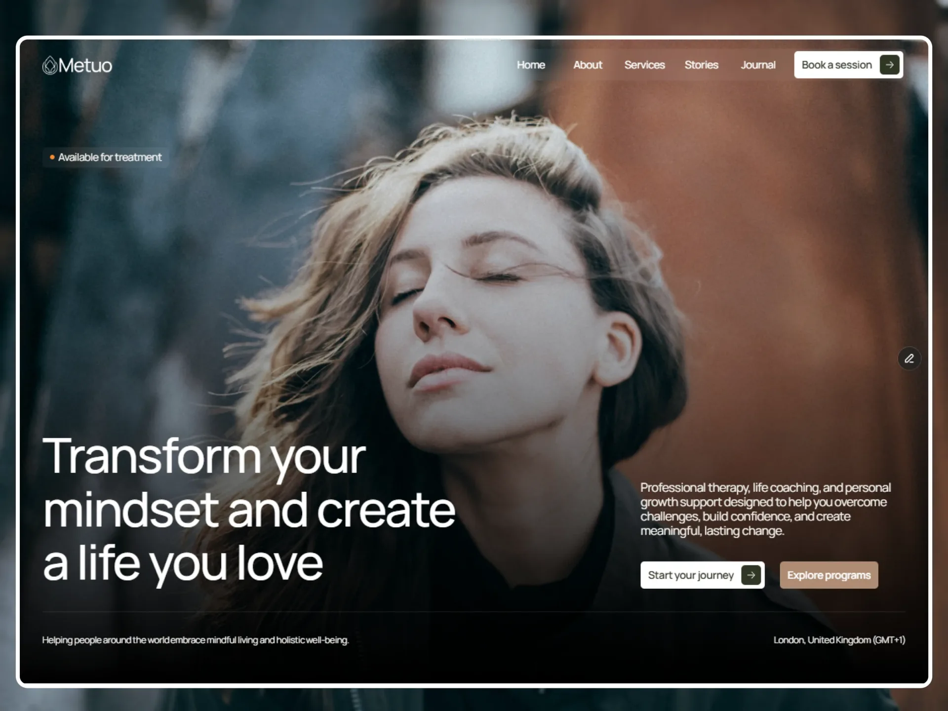
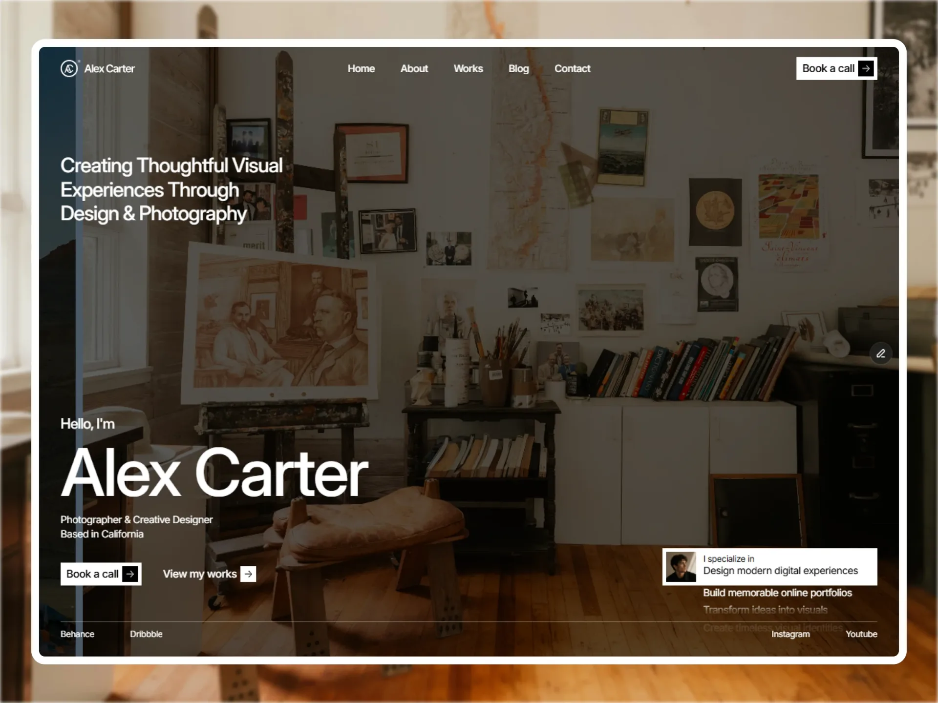
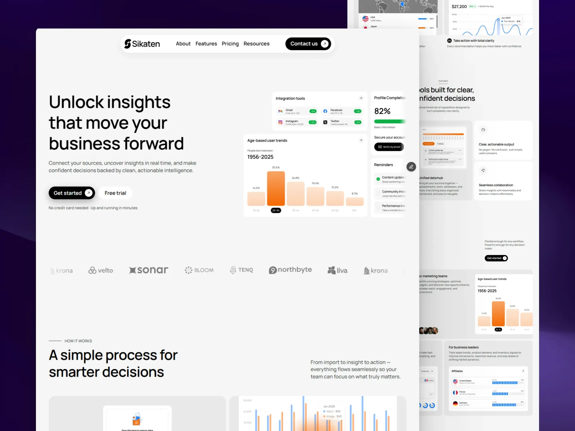
Custom cursor that morphs from a dot into a label or a ring over marked elements.
From the Nitip template — see it in context Hover: label
Hover: label + plus
Hover: ring
import { LabelCursor } from "@/components/ui/label-cursor";

// Demo photo from Unsplash (free under the Unsplash License), loaded from its image CDN.
const image = "https://images.unsplash.com/photo-1698423841762-74410b847396?auto=format&fit=crop&w=800&q=80";

export default function LabelCursorDemo() {
  return (
    <div data-cursor-area className="grid w-full max-w-xl grid-cols-2 gap-4 p-2">
      <LabelCursor scope="[data-cursor-area]" />
      <div data-cursor="View project" className="relative aspect-[4/3] overflow-hidden rounded-lg bg-muted">
        <img src={image} alt="Forest slopes in drifting fog" className="size-full object-cover" />
        <span className="absolute inset-x-0 bottom-0 bg-gradient-to-t from-black/60 to-transparent p-4 text-sm font-medium text-white">
          Hover: label
        </span>
      </div>
      <div
        data-cursor="More details"
        data-cursor-icon="plus"
        className="flex aspect-[4/3] items-end rounded-lg bg-primary p-4 text-sm font-medium text-primary-foreground"
      >
        Hover: label + plus
      </div>
      <div data-cursor="ring" className="col-span-2 flex h-24 items-center justify-center rounded-lg border text-sm">
        Hover: ring
      </div>
    </div>
  );
}
Installation
$ npx shadcn@latest add https://framebrick.co/r/label-cursor.json1. Install the dependencies.
npm install motion clsx tailwind-merge2. Add
cn()tolib/utils.ts(skip if shadcn already created it).import { clsx, type ClassValue } from "clsx"; import { extendTailwindMerge } from "tailwind-merge"; /* tailwind-merge must know the site's type scale (globals.css) is a font size, not a text color — otherwise cn("text-h6 text-muted-foreground") drops text-h6. */ const twMerge = extendTailwindMerge({ extend: { classGroups: { "font-size": [{ text: ["display", "h1", "h2", "h3", "h4", "h5", "h6"] }] } }, }); export function cn(...inputs: ClassValue[]) { return twMerge(clsx(inputs)); }3. Copy the component into
components/ui/label-cursor.tsx."use client"; import * as React from "react"; import { AnimatePresence, animate, motion, useMotionValue, type Transition } from "motion/react"; import { cn } from "@/lib/utils"; /* * Label Cursor — a custom cursor that morphs into a label over marked elements (from the Nitip site cursor). * Render <LabelCursor /> once, then mark elements: * data-cursor="View project" → tooltip-style label centered on the pointer, system cursor hidden * data-cursor-icon="plus" → icon after the label: "arrow" (default), "plus" or "none" * data-cursor="ring" → outlined ring above the pointer, system cursor kept * Elsewhere a small dot trails the pointer (turn it off with dot={false}). It follows the pointer instantly and * morphs between shapes with a spring. Touch-only devices never see it. */ const morph: Transition = { type: "spring", stiffness: 500, damping: 60, mass: 1 }; type Target = { kind: "dot" | "ring" | "label" | "none"; label?: string; icon?: string }; const offsets = { dot: { x: 20, y: 20 }, ring: { x: 20, y: -20 }, label: { x: 0, y: 0 }, none: { x: 0, y: 0 } }; export type LabelCursorProps = { /** Show the small dot when the pointer isn't over a marked element. */ dot?: boolean; /** Only show the cursor inside elements matching this selector (e.g. "[data-cursor-area]"). */ scope?: string; className?: string; }; function Icon({ name }: { name?: string }) { if (name === "none") return null; return ( <svg aria-hidden viewBox="0 0 16 16" fill="none" stroke="currentColor" strokeWidth={1.5} strokeLinecap="round" strokeLinejoin="round" className="size-3.5"> {name === "plus" ? <path d="M8 3v10M3 8h10" /> : <path d="M4.5 11.5l7-7M5.5 4.5h6v6" />} </svg> ); } export function LabelCursor({ dot = true, scope, className }: LabelCursorProps) { const [enabled, setEnabled] = React.useState(false); const [target, setTarget] = React.useState<Target>({ kind: "none" }); const pointer = React.useRef({ x: -100, y: -100 }); const x = useMotionValue(-100); const y = useMotionValue(-100); const opacity = useMotionValue(0); React.useEffect(() => { const query = window.matchMedia("(any-hover: hover)"); const update = () => setEnabled(query.matches); update(); query.addEventListener("change", update); return () => query.removeEventListener("change", update); }, []); React.useEffect(() => { if (!enabled) return; function read(el: Element | null): Target { if (scope && !el?.closest(scope)) return { kind: "none" }; const marked = el?.closest("[data-cursor]"); const value = marked?.getAttribute("data-cursor"); if (!value) return { kind: dot ? "dot" : "none" }; if (value === "ring") return { kind: "ring" }; return { kind: "label", label: value, icon: marked?.getAttribute("data-cursor-icon") ?? "arrow" }; } function place(next: Target) { setTarget((prev) => (prev.kind === next.kind && prev.label === next.label && prev.icon === next.icon ? prev : next)); x.set(pointer.current.x + offsets[next.kind].x); y.set(pointer.current.y + offsets[next.kind].y); animate(opacity, next.kind === "none" ? 0 : 1, { duration: 0.2 }); } function onMove(e: PointerEvent) { if (e.pointerType === "touch") return; pointer.current = { x: e.clientX, y: e.clientY }; place(read(e.target instanceof Element ? e.target : null)); } /* Content scrolls under a still pointer: check what is underneath now. */ function onScroll() { place(read(document.elementFromPoint(pointer.current.x, pointer.current.y))); } function onLeave() { animate(opacity, 0, { duration: 0.2 }); } window.addEventListener("pointermove", onMove, { passive: true }); window.addEventListener("scroll", onScroll, { passive: true, capture: true }); document.documentElement.addEventListener("mouseleave", onLeave); window.addEventListener("blur", onLeave); return () => { window.removeEventListener("pointermove", onMove); window.removeEventListener("scroll", onScroll, { capture: true }); document.documentElement.removeEventListener("mouseleave", onLeave); window.removeEventListener("blur", onLeave); }; }, [enabled, dot, scope, opacity, x, y]); const isLabel = target.kind === "label"; React.useEffect(() => { document.documentElement.toggleAttribute("data-label-cursor", enabled && isLabel); return () => document.documentElement.removeAttribute("data-label-cursor"); }, [enabled, isLabel]); if (!enabled) return null; const size = target.kind === "ring" ? 44 : isLabel ? "auto" : 12; return ( <> <style>{`[data-label-cursor], [data-label-cursor] * { cursor: none !important; }`}</style> <motion.div aria-hidden style={{ x, y, opacity }} className="pointer-events-none fixed top-0 left-0 z-[100]"> <div className={cn("-translate-x-1/2", target.kind === "ring" && "-translate-y-full", isLabel && "-translate-y-1/2")}> <motion.div initial={false} animate={{ width: size, height: size, borderRadius: target.kind === "ring" ? 22 : 6 }} transition={morph} className={cn( "overflow-hidden border transition-colors duration-200", target.kind === "ring" && "border-foreground bg-transparent", target.kind === "dot" && "border-transparent bg-foreground", /* The hairline keeps the label visible over dark surfaces */ isLabel && "border-background/25 bg-foreground", isLabel && "shadow-md", className, )} > <AnimatePresence initial={false} mode="popLayout"> {isLabel && ( <motion.span key={`${target.label}-${target.icon}`} initial={{ opacity: 0 }} animate={{ opacity: 1 }} exit={{ opacity: 0 }} transition={{ duration: 0.15 }} className="flex items-center gap-1.5 px-3 py-1.5 text-xs font-medium whitespace-nowrap text-background" > {target.label} <Icon name={target.icon} /> </motion.span> )} </AnimatePresence> </motion.div> </div> </motion.div> </> ); }
Usage
import { LabelCursor } from "@/components/ui/label-cursor";

// once, in the root layout
<LabelCursor />

// anywhere
<a href="/work/aurora" data-cursor="View project">…</a>
<button data-cursor="More details" data-cursor-icon="plus">…</button>
<figure data-cursor="ring">…</figure>
Props
| Prop | Type | Default | Description |
|---|---|---|---|
| dot | boolean | true | Show the small trailing dot outside marked elements. |
| scope | string | — | CSS selector: only show the cursor inside matching elements. |
| className | string | — | Classes for the morphing shape. |
- data-cursor="<text>" shows a label centered on the pointer and hides the system cursor.
- data-cursor-icon="arrow" (default), "plus" or "none" sets the icon after the label.
- data-cursor="ring" shows an outlined ring above the pointer and keeps the system cursor.
- Only runs on devices that can hover; touch screens never see it.
AI prompt
Paste into v0, Lovable, Bolt or Claude to rebuild this component in your own project.
Create a React + Tailwind CSS + Motion (motion/react) component called LabelCursor — a custom cursor rendered once in the layout.
- A fixed, pointer-events-none element that follows the pointer instantly (motion values x/y set on pointermove).
- It reads the element under the pointer: closest [data-cursor].
  - none → a 12px dot (bg-foreground) 20px below-right of the pointer; system cursor stays.
  - data-cursor="ring" → a 44px outlined ring (1px border-foreground) offset (20, -20) above the pointer.
  - any other value → a label centered on the pointer styled like the shadcn Tooltip: bg-foreground, text-background,
    rounded-md, px-3 py-1.5, text-xs font-medium, shadow-md,
    the text from the attribute plus an icon from data-cursor-icon (arrow default, plus, none). Hide the system cursor
    while the label shows (toggle an attribute on <html> and a style rule cursor:none !important).
- Width, height and corner radius (dot 6, ring 22, label 6) morph with a spring (stiffness 500, damping 60);
  the label text cross-fades in 0.15s.
- Fade the cursor out when the pointer leaves the window; re-check the element under the pointer on scroll.
- Only enable when matchMedia("(any-hover: hover)") matches; ignore touch pointers. Optional scope selector and dot toggle.