DESIGN.md Tailwind v4 CSS variables
---
version: "alpha"
name: "Metuo"
description: "Therapy and life-coaching website: a warm off-white page, white cards, deep green type and buttons, an orange hover, set in Manrope."
colors:
  green: "#2F3724"
  black: "#000000"
  black-30: "rgba(0, 0, 0, 0.3)"
  black-05: "rgba(0, 0, 0, 0.05)"
  line: "rgba(0, 0, 0, 0.1)"
  grey: "#707070"
  brown: "#AE8C73"
  orange: "#F98B31"
  soft-grey: "#B4B4B4"
  background: "#FCFBF6"
  white: "#FFFFFF"
  white-05: "rgba(255, 255, 255, 0.05)"
  pressed: "#333333"
  error: "#FF2244"
  error-fill: "rgba(255, 34, 68, 0.15)"
  spinner: "#999999"
  primary: "{colors.green}"
  on-primary: "{colors.white}"
  secondary: "{colors.orange}"
  on-secondary: "{colors.white}"
  tertiary: "{colors.brown}"
  neutral: "{colors.background}"
  surface: "{colors.white}"
  on-surface: "{colors.green}"
  on-surface-variant: "{colors.grey}"
  outline: "{colors.line}"
typography:
  display:
    fontFamily: "Manrope"
    fontSize: "64px"
    fontWeight: 500
    lineHeight: 1.1
    letterSpacing: "-0.03em"
  h1:
    fontFamily: "Manrope"
    fontSize: "54px"
    fontWeight: 500
    lineHeight: 1.1
    letterSpacing: "-0.03em"
  h2:
    fontFamily: "Manrope"
    fontSize: "40px"
    fontWeight: 500
    lineHeight: 1.1
    letterSpacing: "-0.03em"
  h3:
    fontFamily: "Manrope"
    fontSize: "36px"
    fontWeight: 500
    lineHeight: 1.1
    letterSpacing: "-0.03em"
  h4:
    fontFamily: "Manrope"
    fontSize: "28px"
    fontWeight: 500
    lineHeight: 1.1
    letterSpacing: "-0.03em"
  h5:
    fontFamily: "Manrope"
    fontSize: "24px"
    fontWeight: 500
    lineHeight: 1.1
    letterSpacing: "-0.03em"
  h6:
    fontFamily: "Manrope"
    fontSize: "20px"
    fontWeight: 500
    lineHeight: 1.2
    letterSpacing: "-0.03em"
  paragraph:
    fontFamily: "Manrope"
    fontSize: "16px"
    fontWeight: 400
    lineHeight: 1.2
    letterSpacing: "-0.03em"
  small:
    fontFamily: "Manrope"
    fontSize: "14px"
    fontWeight: 400
    lineHeight: 1.2
    letterSpacing: "-0.03em"
  tiny:
    fontFamily: "Manrope"
    fontSize: "12px"
    fontWeight: 400
    lineHeight: 1.2
    letterSpacing: "-0.03em"
  menu:
    fontFamily: "Manrope"
    fontSize: "14px"
    fontWeight: 500
    lineHeight: 1.2
    letterSpacing: "-0.03em"
  button:
    fontFamily: "Manrope"
    fontSize: "14px"
    fontWeight: 600
    lineHeight: 1.2
    letterSpacing: "-0.03em"
rounded:
  card: "10px"
  control: "5px"
  checkbox: "4px"
  round: "9999px"
spacing:
  gutter: "30px"
  gutter-phone: "15px"
  gutter-tablet: "20px"
  section-padding: "100px"
  section-padding-phone: "60px"
  section-padding-tablet: "80px"
  content-max: "1200px"
  header-height: "82px"
  header-height-phone: "65px"
  sticky-top: "120px"
  page-title-height: "78vh"
  page-title-height-tablet: "80vh"
  page-title-padding: "150px 30px 50px"
  page-title-padding-phone: "100px 15px 30px"
  page-title-padding-tablet: "120px 20px 40px"
components:
  button-primary:
    backgroundColor: "{colors.green}"
    textColor: "{colors.white}"
    typography: "{typography.button}"
    rounded: "{rounded.control}"
    padding: "5px 5px 5px 10px"
    height: "36px"
  button-primary-hover:
    backgroundColor: "{colors.orange}"
  button-white:
    backgroundColor: "{colors.white}"
    textColor: "{colors.green}"
    typography: "{typography.button}"
    rounded: "{rounded.control}"
    padding: "5px 5px 5px 10px"
    height: "36px"
  button-brown:
    backgroundColor: "{colors.brown}"
    textColor: "{colors.white}"
    typography: "{typography.button}"
    rounded: "{rounded.control}"
    padding: "9px 10px"
    height: "36px"
  menu-link:
    textColor: "{colors.green}"
    typography: "{typography.menu}"
    rounded: "{rounded.control}"
    padding: "5px 10px"
    width: "75px"
    height: "27px"
  section-label:
    textColor: "{colors.grey}"
    typography: "{typography.small}"
  number-bubble:
    backgroundColor: "{colors.green}"
    textColor: "{colors.white}"
    typography: "{typography.small}"
    rounded: "{rounded.round}"
    size: "24px"
  plus-minus:
    backgroundColor: "{colors.green}"
    textColor: "{colors.white}"
    rounded: "{rounded.control}"
    size: "24px"
  plus-minus-open:
    backgroundColor: "{colors.soft-grey}"
    textColor: "{colors.green}"
  accordion-row:
    backgroundColor: "{colors.white}"
    textColor: "{colors.green}"
    typography: "{typography.h6}"
    rounded: "{rounded.card}"
    padding: "20px"
  pricing-switch:
    backgroundColor: "{colors.soft-grey}"
    rounded: "{rounded.round}"
    padding: "3px"
    width: "64px"
    height: "30px"
  pricing-switch-on:
    backgroundColor: "{colors.green}"
  price-card:
    backgroundColor: "{colors.white}"
    textColor: "{colors.green}"
    rounded: "{rounded.card}"
    padding: "30px 20px"
  price-card-featured:
    backgroundColor: "{colors.green}"
    textColor: "{colors.white}"
  post-card:
    textColor: "{colors.green}"
    typography: "{typography.h6}"
    rounded: "{rounded.card}"
  input-field:
    textColor: "{colors.black}"
    rounded: "{rounded.control}"
    padding: "12px"
    height: "42px"
  checkbox:
    rounded: "{rounded.checkbox}"
    size: "17px"
  submit-button:
    backgroundColor: "{colors.green}"
    textColor: "{colors.white}"
    typography: "{typography.button}"
    rounded: "{rounded.control}"
    padding: "10px"
    height: "37px"
  submit-button-hover:
    backgroundColor: "{colors.orange}"
  submit-button-pressed:
    backgroundColor: "{colors.pressed}"
---

# Metuo Design System

> The design tokens and style rules of **Metuo**, a website template by Framebrick (live Framer site: https://metuo.framer.website). Read it before you build or change a page so new work matches the template. The front matter holds the exact values; the sections below say where and how to use them. Format: [DESIGN.md](https://github.com/google-labs-code/design.md), spec version `alpha`.

## Overview

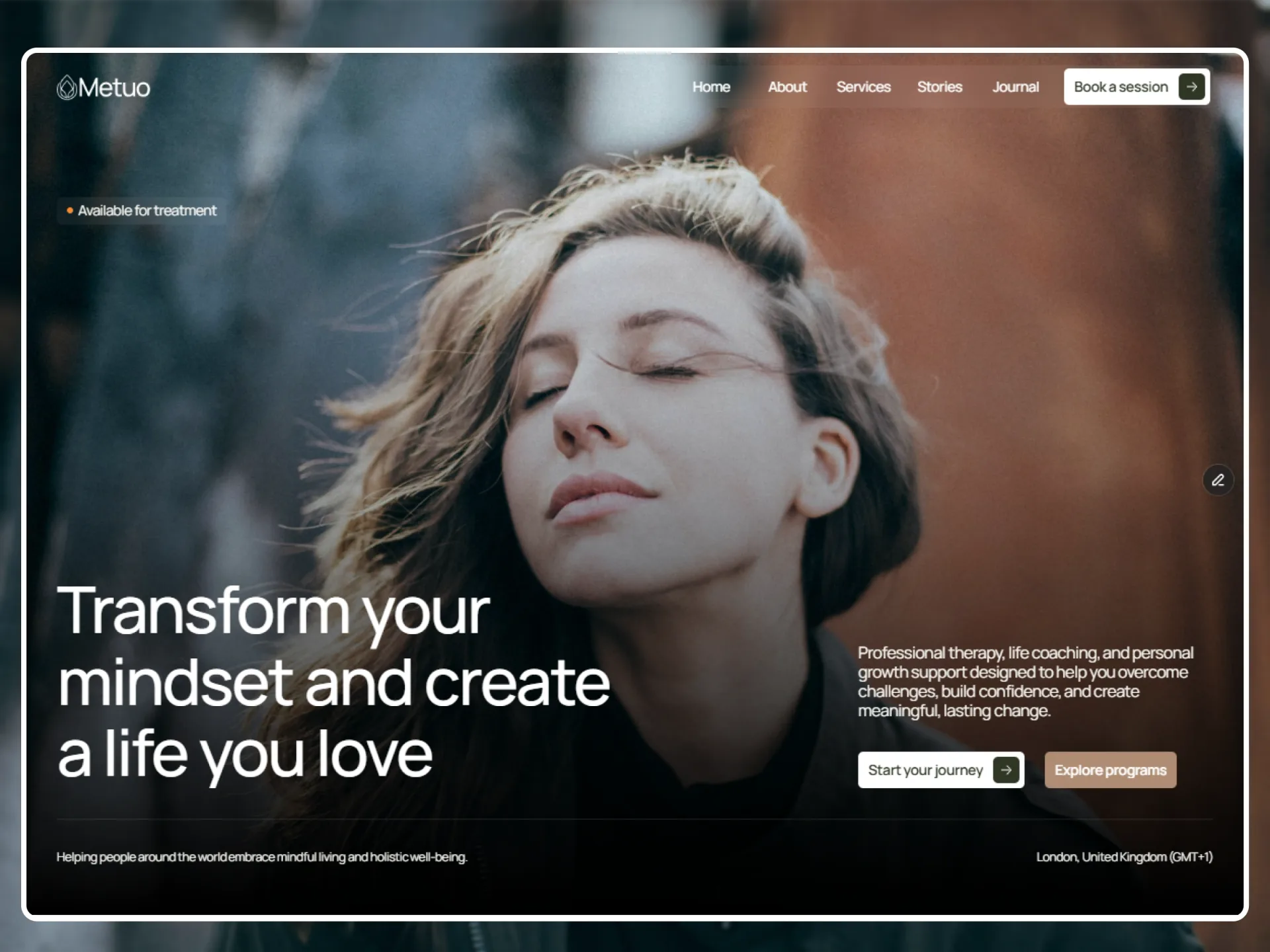
Metuo is a website template for therapists, life coaches and wellness professionals: services with plans and a booking form, client stories, the team, a journal and legal pages. It should feel calm, warm and trustworthy: soft light surfaces, large photos of people under a dark veil, and plenty of air between sections.

The look is built from few parts. The page is a warm off-white Background (#FCFBF6); content sits on White cards and rows with 10px corners; type is a deep Green (#2F3724), with Grey (#707070) for leads, answers, labels and meta. Green also fills the main buttons, the number bubbles, the plus boxes, the featured price card and a checked box. Orange (#F98B31) is the hover: a fill that rises from a button's bottom, the second copy of a rolling footer link, the stars of the rating. Brown (#AE8C73) appears once, as the Home hero's second button. Photos at the top of a page and behind the founder quote carry White text over a dark veil.

Everything is set in Manrope with a tight letter spacing (-0.03em): 500 for headings and the menu, 600 for buttons, 400 for text. Buttons, fields and small boxes have 5px corners, cards and photos 10px, and only the bubbles, client photos and the switch are round. Motion is smooth and unhurried: springs of 0.4 s without bounce for nearly every state change, labels that roll up on hover, rows that open one at a time, photos that scroll at half speed, and a hero that grows in while its words appear one by one.

## Colors

- **Green (#2F3724)** — `green`, `primary`, `on-surface`. Green: headings and text on the light page, the Green buttons and their arrow boxes, number bubbles, the plus box, the pricing switch when on, a checked box, the featured price card, the header's sliding pill.
- **Black (#000000)** — `black`. Black: text typed into a field; the footer's hairline at 10%.
- **Black 30 (rgba(0, 0, 0, 0.3))** — `black-30`. Black 30: placeholders, an empty date or time, a focused field's border.
- **Black 05 (rgba(0, 0, 0, 0.05))** — `black-05`. Black 05: the fill and the hairline border of fields and checkboxes.
- **Line (rgba(0, 0, 0, 0.1))** — `line`, `outline`. The footer's 1px hairline (Black at 10%).
- **Grey (#707070)** — `grey`, `on-surface-variant`. Grey: leads, descriptions, answers, rich text, card meta, field labels, footer column titles, the section label, the pricing labels.
- **Brown (#AE8C73)** — `brown`, `tertiary`. Brown: the Home hero's second button.
- **Orange (#F98B31)** — `orange`, `secondary`. Orange: the buttons' hover fill, the Submit hover, the stars, "(32% off)", the second copy of a footer link, the e-mail link's hover.
- **Soft grey (#B4B4B4)** — `soft-grey`. Soft Grey: the pricing switch when off, the minus box of an open row, the phone menu button on the light header.
- **Background (#FCFBF6)** — `background`, `neutral`. Background: the page, the solid header, the footer card, the bio panel, text on dark cards.
- **White (#FFFFFF)** — `white`, `on-primary`, `on-secondary`, `surface`. White: cards and rows, the White button, the header's link pill on the light header, text and links over photos.
- **White 05 (rgba(255, 255, 255, 0.05))** — `white-05`. White 05: the glass behind the header's links and the phone menu button over a photo (with an 8px background blur), the hero eyebrow.
- **Pressed (#333333)** — `pressed`. The Submit button while pressed.
- **Error (#FF2244)** — `error`. Error: a field's message and border after a failed check, the Submit label after a failed send.
- **Error fill (rgba(255, 34, 68, 0.15))** — `error-fill`. The Submit button's fill after a failed send.
- **Spinner (#999999)** — `spinner`. The ring of the blog list's loading spinner.
- **Gradient `veil`:** `linear-gradient(180deg, rgba(255, 255, 255, 0) 0%, rgba(0, 0, 0, 0.3) 50.3536%, #000000 100%)`. The dark veil over every big photo: the page titles, the Home hero, the founder quote, a post's cover. It moves with its photo.
- **Gradient `band`:** `linear-gradient(180deg, #FCFBF6 0%, #FFFFFF 4.91981%, #FFFFFF 100%)`. The call to action band and the booking section: the page colour fading to White in the first 5%.
- **Gradient `spinner`:** `conic-gradient(from 0deg, rgba(255, 255, 255, 0) 0deg, #999999 342deg)`. The blog list's loading ring (a 2px ring cut from it, a 2 x 2 dot at its head).
- **Gradient `submit-spinner`:** `conic-gradient(from 0deg, rgba(255, 255, 255, 0) 7.2deg, #FFFFFF 342deg)`. The Submit button's loading ring (2px, a 2px White dot at its head).

Semantic names in the front matter point at these colours: `primary` → `green`, `on-primary` → `white`, `secondary` → `orange`, `on-secondary` → `white`, `tertiary` → `brown`, `neutral` → `background`, `surface` → `white`, `on-surface` → `green`, `on-surface-variant` → `grey`, `outline` → `line`.

## Typography

**Manrope, sans-serif.** Manrope from Google Fonts (variable; weights 400, 500, 600 and 700 in use). Every text style has letter spacing -0.03em; fields use -0.01em.

Font sizes change at the breakpoints (phone / tablet from 810px / desktop from 1200px); the front matter gives the desktop size. Line height is a multiple of the font size.

| Token | Size (phone / tablet / desktop) | Line height | Weight | Letter spacing | Use |
|---|---|---|---|---|---|
| `display` | 52px / 58px / 64px | 1.1 | 500 | -0.03em | Display 1: page titles over a photo (the page-title band, the 404), the Home hero's title |
| `h1` | 42px / 48px / 54px | 1.1 | 500 | -0.03em | Heading 1: page titles on the light page (a post, a legal page, Contact), big figures and prices |
| `h2` | 32px / 36px / 40px | 1.1 | 500 | -0.03em | Heading 2: section titles |
| `h3` | 28px / 32px / 36px | 1.1 | 500 | -0.03em | Heading 3: the founder quote, the call to action band's title, headings inside a post or a legal page |
| `h4` | 24px / 26px / 28px | 1.1 | 500 | -0.03em | Heading 4: plan names, the booking form's title, story headlines on Home |
| `h5` | 20px / 19px / 24px | 1.1 | 500 | -0.03em | Heading 5: the lead of a page-title band, story headlines on the Testimonial page. The tablet size is smaller than the phone size, as measured |
| `h6` | 18px / 19px / 20px | 1.2 | 500 | -0.03em | Heading 6: card, row and question titles, quotes, the figures' title |
| `paragraph` | 16px | 1.2 | 400 | -0.03em | Medium Paragraph: leads, descriptions, answers, rich text, footer links and labels |
| `small` | 14px | 1.2 | 400 | -0.03em | Small Paragraph: the section label, card meta (category, date), field labels, number bubbles, bios |
| `tiny` | 12px | 1.2 | 400 | -0.03em | Tiny: the Home hero's foot line, the plans' "Perfect for" notes |
| `menu` | 14px | 1.2 | 500 | -0.03em | Menu: the header's links |
| `button` | 14px | 1.2 | 600 | -0.03em | Button: button labels, the Submit button |

## Layout

Three layouts: phone below 810px, tablet from 810px, desktop from 1200px. Spacing tokens without a suffix are the desktop values; `-tablet` and `-phone` give the smaller screens where they differ.

| Token | Phone / tablet / desktop | Use |
|---|---|---|
| `gutter` | 15px / 20px / 30px | Side padding of sections and of the header |
| `section-padding` | 60px / 80px / 100px | Vertical padding (top and bottom) of most sections |
| `content-max` | 1200px | Maximum content width of every section, the header row and the footer card: from 1260 wide the content is exactly 1200 and centred (1140 inside the gutters at 1200) |
| `header-height` | 65px / 82px / 82px | The fixed header bar; pages without a photo at the top start below a spacer of this height |
| `sticky-top` | 120px | Where the pinned intro and list of the Why and Values sections stick, from tablets up |
| `page-title-height` | 78vh / 80vh / 78vh | The page-title band and a post's cover: a share of the window's height (658 / 720 / 702 in 390 x 844, 810 x 900 and 1200 x 900 windows; About uses 78% on tablets too) |
| `page-title-padding` | 100px 15px 30px / 120px 20px 40px / 150px 30px 50px | Padding of the page-title band as CSS shorthand (top, sides, bottom) per breakpoint |

Every section is centred, at most `content-max` (1200px) wide inside the `gutter` on each side, and padded top and bottom by `section-padding` unless it sets its own; sections clip their edges with `overflow: clip`, so the pinned blocks inside them still stick. The header is fixed over the page, `header-height` tall: pages with a photo at the top (Home, About, Service, Testimonial, Blog) run under it, the others start below a spacer of its height. Page-title bands and a post's cover take `page-title-height` of the window with `page-title-padding`; the Home hero takes the whole window.

Section titles are a Section intro: the label ("// Our prices", `small`, Grey), 10px below the title (`h2`, Green), 30px below the lead (`paragraph`, Grey). Rows and cards in a list are 10px apart; card grids 20px. Long layouts pin a column `sticky-top` (120px) from the top while photos scroll beside it.

## Elevation & Depth

Metuo is flat: there are no shadows anywhere. Depth comes from fills and photos: White cards and rows on the warm Background, the Green featured price card, the light footer card over a full-width photo, and the dark `veil` gradient (clear at the top, black at the bottom) over every big photo that carries White text. The glass of the see-through header is White 05 behind an 8px background blur. The booking section and the call to action band fade from the Background to White in their first 5% (`band`).

## Shapes

Boxes have small, even corners: `control` (5px) for buttons, fields, the menu pill and the plus box, `card` (10px) for cards, rows and photos, `checkbox` (4px) for the 17px checkboxes. Round shapes are kept for the number bubbles, the client photos, the dots of the lists and the pricing switch.

- **`card` (10px):** Cards and rows, photos, the post cover, the footer card.
- **`control` (5px):** Buttons and their arrow boxes, fields, the Submit button, the header's link pill and sliding pill, the menu button, the plus box, portraits.
- **`checkbox` (4px):** The 17px checkboxes.
- **`round` (9999px):** Number bubbles, client photos, the pricing switch and its dot, dots.

## Motion

Reduced motion: rises, rolls, slides, turns, zooms, parallax and scroll transforms happen in place or not at all (scroll-linked blocks sit at their end values), row heights change at once and the spinners stand still, while fades and colour changes still animate.

- **`spring`** — spring (duration 0.4 s, bounce 0). S0, nearly every state change: button hovers (fill, label roll, arrow), the header's look change, sliding pill and link roll, the phone menu, footer link rolls, row heights, the price roll, the client photos rising. Settles in about 0.42 to 0.5 s without overshoot. As a CSS curve: linear(0, 0.037, 0.123, 0.229, 0.34, 0.445, 0.54, 0.623, 0.695, 0.754, 0.803, 0.844, 0.876, 0.903, 0.924, 0.94, 0.953, 0.964, 0.972, 0.978, 0.983, 0.987, 0.99, 0.992, 0.994, 0.995, 0.997, 0.997, 1).
- **`spring-soft`** — spring (duration 0.4 s, bounce 0.2). S2, a slight overshoot (1 to 3%): the post card photo, the social icons dimming and lifting, the plus-minus turn, the pricing switch, the lit list items. As a CSS curve: linear(0, 0.035, 0.12, 0.231, 0.352, 0.47, 0.58, 0.676, 0.759, 0.826, 0.881, 0.923, 0.954, 0.977, 0.993, 1.004, 1.01, 1.014, 1.015, 1.015, 1.014, 1.012, 1.01, 1.009, 1.007, 1.005, 1.004, 1.003, 1).
- **`ease-appear`** — `cubic-bezier(0.73, 0, 0.33, 1)`. TA, the page-load appear.
- **`appear`** — duration 0.6s, ease `ease-appear`, from opacity 0, 18px lower (35px in the Home hero). TA: the header's logo and menu button (0.7 s), its links (0.8, 0.9, 1.0, 1.1, 1.2 s) and its button (1.3 s), and the Home hero's eyebrow and buttons, each after its own delay, once on load. Reduced motion: a fade only.
- **`ease-zoom`** — `cubic-bezier(0.79, 0.01, 0.15, 0.99)`. TZ, the Home hero's photo zoom.
- **`hero-zoom`** — delay 0.5s, duration 0.8s, ease `ease-zoom`, from scale 0.2. TZ: the Home hero's photo and veil grow to full size once on load. Reduced motion: no zoom.
- **`words`** — transition spring, stagger 0.05s, from opacity 0, 10px lower, blur 10px. TW, text effect: the Home hero's title, lead and foot line come in word by word on load. Reduced motion: no rise, the fade and blur stay.
- **`ease-card`** — `cubic-bezier(0.5, 0, 0.88, 0.77)`. TT, an ease-in.
- **`card-tween`** — duration 0.4s, ease `ease-card`. TT: a team card's bio panel and its plus button (open and close).
- **`ease-form`** — `cubic-bezier(0.44, 0, 0.56, 1)`. The ease-in-out of the Submit button (TS), the list spinner's fade (TL) and the story portraits (TP).
- **`submit-fill`** — duration 0.2s, ease `ease-form`. TS: the Submit button's fill, Green to Orange on hover and Pressed grey while pressed.
- **`spinner-fade`** — duration 0.3s, ease `ease-form`. TL: the blog list's spinner fades in when half of it is on screen and out when it leaves.
- **`portrait-slide`** — duration 0.4s, ease `ease-form`. TP: the column of portraits in the Home stories card slides one portrait. Reduced motion: no slide.
- **`scroll-smooth`** — spring (stiffness 500, damping 60, mass 1). SP: smooths a scroll-linked value (the Home About photo's zoom).
- **`parallax`** — speed 0.5, from scroll 0. Page-title photos, the Home hero and a post's cover move down by half the page's scroll (scroll at half speed). Reduced motion: they scroll with the page.
- **`scroll-in`** — progress (scroll + window height - block top) / block height, clamped 0 to 1, ease linear. Scroll transforms while a block scrolls in: the founder quote photo (y -100 to 100), the video (scale 0.6 to 1, y -160 to 0), the footer (y -200 to 0, reaching 0 at the end of the page). Reduced motion: the end values.
- **`spin`** — type tween, duration 1s, ease linear, repeat infinite. The 20px loading rings (blog list, Submit) turn once a second; they stand still with reduced motion.
- **`header-switch`** — threshold 0.5, transition spring. On a page with a photo at the top, the header turns solid when the section after the photo reaches the middle of the window, and back above it.
- **`tap-close`** — delay 0.1s. A tap on a link or the logo in the open phone menu closes it after 0.1 s.

## Components

Component tokens below use the exact values of the template. Variants with a suffix (`-hover`, `-pressed`, `-open`, `-on`, `-featured`) only list what changes.

- **`button-primary`** (Button). The Green button: the label and, 10px to its right, a 26px White arrow box (5px corners) with a Green 14px arrow. The label never wraps.
- **`button-primary-hover`** (Button). Hover: an Orange fill rises from the bottom edge, the label rolls up to a second copy and the arrow slides out to the right as another comes in (spring, 0.4 s, no bounce).
- **`button-white`** (Button). The White button, over photos and on the Green price card, with a Green arrow box; on hover the Orange fill rises and the label and arrow box turn White.
- **`button-brown`** (Button). The Home hero's second button, without an arrow box.
- **`menu-link`** (Menu link). A header link; White over a photo. On hover a shared Green pill slides under it, its label turns White and rolls up.
- **`section-label`** (Section label). "//" and the label 5px apart, above a section title or a post's title.
- **`number-bubble`** (Service card). "01", "02" … at the start of a numbered row or service card.
- **`plus-minus`** (Plus-minus). The plus of a closed row: two crossed 12 × 1 lines.
- **`plus-minus-open`** (Plus-minus). The minus of an open row; the second line turns flat with a slight overshoot.
- **`accordion-row`** (Accordion row). A question, a process step or a service row: the title in `h6` with the Plus-minus 20px to its right; the answer in `paragraph` Grey grows open under it.
- **`pricing-switch`** (Pricing switch). Monthly: a 24px White dot at the left. The labels beside it are `small` Grey and never change.
- **`pricing-switch-on`** (Pricing switch). Yearly: the dot slides 34px to the right with a slight overshoot.
- **`price-card`** (Price card). A plan: the name in `h4`, the price in `h1`, the description and the list in `paragraph` Grey, a Green button at the bottom.
- **`price-card-featured`** (Price card). The middle plan: White name, price and "Includes:", Background text and dots, a White button.
- **`post-card`** (Post card). A photo at 367 : 244 with 10px corners, zoomed to 105% and easing to 100% on hover; under it the category and date in `small` Grey and the title in `h6` Green, on one line.
- **`input-field`** (Field). A Black 05 fill with a 1px Black 05 border inside, 16px text at line height 1.1 and -0.01em, a Black 30 placeholder; the label (`small`, Grey) sits 10px above. Focus turns the border Black 30 at once, no outline ring. The message area is at least 200px tall.
- **`checkbox`** (Checkbox group). A Black 05 box with a hairline; checked, it turns Green with a White tick at once. Its name sits 10px to the right in `small` Grey.
- **`submit-button`** (Submit button). The booking form's Submit, as wide as its column. While sending, a 20px White ring turns in place of the label; after a send it reads "Thank you", after a failed send "Something went wrong" in Error on a 15% Error fill.
- **`submit-button-hover`** (Submit button). Hover: Orange (0.2 s, ease-form).
- **`submit-button-pressed`** (Submit button). Pressed: #333333.

Other components of the template, described in its spec: Footer link, Logo, Icon, Hamburger, Social list, Section, Section intro, Parallax, Scroll transform, Collapse, Word effect, Team card, Testimonial card, Client ratings, Fact list, Point item, Service list, Scroll-spy list, Story cards, Pricing plans, Load on scroll, Rich text, Video band, Form, Current year.

## Do's and Don'ts

- Do set headings and body text in Green on the Background or on White cards, and use Grey for leads, answers, labels and meta.
- Do use Green for the main buttons and markers (number bubbles, plus boxes, a checked box, the featured plan) and Orange only for hovers, the rating stars and the yearly discount.
- Do keep the letter spacing at -0.03em in every text style (-0.01em in form fields), with headings at weight 500 and line height 1.1.
- Do give buttons, fields and small boxes 5px corners and cards, rows and photos 10px; keep round shapes for bubbles, client photos, dots and the switch.
- Do put White text over a photo only with the dark `veil` gradient under it.
- Do animate hovers and state changes with `spring` (0.4 s, no bounce); roll button and link labels up on hover instead of changing their colour alone.
- Don't add shadows or new colours; the palette above is the whole palette.
- Don't use Orange as a resting fill or for running text; it is the hover colour.
- Don't use pure black for text; Black is only for what a visitor types into a field.
- Don't let a button label wrap.
- Don't mix fonts: Manrope is the only family.

## Source

Every value here was measured from the published Metuo template (https://metuo.framer.website); when this file and the live site disagree, the site is right.

Demo photos (Unsplash, Pexels) and the two Pexels videos are placeholders and not part of the design system.

This DESIGN.md is licensed under [CC BY 4.0](https://creativecommons.org/licenses/by/4.0/): use and adapt it freely, with credit to Framebrick. The template itself (its pages, code and images) is covered by the Framebrick license: https://framebrick.co/license
Use it with your agent
Save it as DESIGN.md at your project’s root. Ask Claude Code, Cursor, v0 or Lovable to follow it for every page and component it builds. Or let the agent fetch it: the Framebrick MCP server’s get_design_md tool with { "slug": "metuo" }, or the raw file at framebrick.co/templates/metuo/design.md . Connect the MCP server