DESIGN.md Tailwind v4 CSS variables
---
version: "alpha"
name: "KorDent"
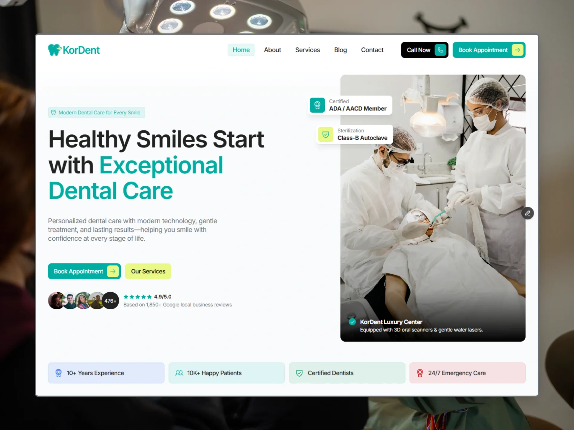
description: "Dental clinic website: a near-white page, white cards, ink type, one teal accent with a lime highlight and a deep night footer."
colors:
  primary: "#00ADA2"
  ink: "#222222"
  black: "#000000"
  muted: "#6F7278"
  white: "#FFFFFF"
  stone: "#F5F3F2"
  page: "#F8FAFC"
  lime: "#E9F885"
  night: "#020618"
  mist: "#CAD5E2"
  amber: "#FFB900"
  blue: "#155DFC"
  green: "#009966"
  red: "#E7000B"
  red-deep: "#AD0009"
  error: "#FF2244"
  placeholder: "#999999"
  on-primary: "{colors.white}"
  secondary: "{colors.black}"
  on-secondary: "{colors.white}"
  tertiary: "{colors.lime}"
  neutral: "{colors.page}"
  surface: "{colors.white}"
  on-surface: "{colors.ink}"
  on-surface-variant: "{colors.muted}"
  outline: "{colors.stone}"
typography:
  h1:
    fontFamily: "Inter"
    fontSize: "56px"
    fontWeight: 600
    lineHeight: 1.1
    letterSpacing: "-0.03em"
    fontVariation: "'opsz' 14"
  h2:
    fontFamily: "Inter"
    fontSize: "36px"
    fontWeight: 600
    lineHeight: 1.2
    letterSpacing: "-0.03em"
    fontVariation: "'opsz' 14"
  h3:
    fontFamily: "Inter"
    fontSize: "32px"
    fontWeight: 600
    lineHeight: 1.2
    letterSpacing: "-0.03em"
    fontVariation: "'opsz' 14"
  h4:
    fontFamily: "Inter"
    fontSize: "28px"
    fontWeight: 600
    lineHeight: 1.2
    letterSpacing: "-0.03em"
    fontVariation: "'opsz' 14"
  h5:
    fontFamily: "Inter"
    fontSize: "24px"
    fontWeight: 600
    lineHeight: 1.2
    letterSpacing: "-0.03em"
    fontVariation: "'opsz' 14"
  h6:
    fontFamily: "Inter"
    fontSize: "20px"
    fontWeight: 600
    lineHeight: 1.2
    letterSpacing: "-0.03em"
    fontVariation: "'opsz' 14"
  body-large:
    fontFamily: "Inter"
    fontSize: "16px"
    fontWeight: 400
    lineHeight: 1.3
    letterSpacing: "-0.03em"
    fontVariation: "'opsz' 14"
  body:
    fontFamily: "Inter"
    fontSize: "14px"
    fontWeight: 400
    lineHeight: 1.3
    letterSpacing: "-0.03em"
    fontVariation: "'opsz' 14"
  body-bold:
    fontFamily: "Inter"
    fontSize: "14px"
    fontWeight: 700
    lineHeight: 1.3
    letterSpacing: "-0.03em"
    fontVariation: "'opsz' 14"
  menu:
    fontFamily: "Inter"
    fontSize: "15px"
    fontWeight: 500
    lineHeight: 1.2
    letterSpacing: "-0.03em"
    fontVariation: "'opsz' 14"
  button:
    fontFamily: "Inter"
    fontSize: "14px"
    fontWeight: 500
    lineHeight: 1.2
    letterSpacing: "-0.03em"
    fontVariation: "'opsz' 14"
  caption:
    fontFamily: "Inter"
    fontSize: "12px"
    fontWeight: 400
    lineHeight: 1.3
    letterSpacing: "-0.02em"
    fontVariation: "'opsz' 14"
  caption-bold:
    fontFamily: "Inter"
    fontSize: "12px"
    fontWeight: 700
    lineHeight: 1.3
    letterSpacing: "-0.02em"
    fontVariation: "'opsz' 14"
  tiny:
    fontFamily: "Inter"
    fontSize: "10px"
    fontWeight: 400
    lineHeight: 1.3
    letterSpacing: "0em"
    fontVariation: "'opsz' 14"
  tiny-bold:
    fontFamily: "Inter"
    fontSize: "10px"
    fontWeight: 700
    lineHeight: 1.3
    letterSpacing: "0em"
    fontVariation: "'opsz' 14"
rounded:
  tag: "2px"
  chip: "6px"
  button: "8px"
  panel: "12px"
  round: "9999px"
spacing:
  gutter: "30px"
  gutter-phone: "15px"
  gutter-tablet: "20px"
  section-padding: "100px"
  section-padding-phone: "60px"
  section-padding-tablet: "80px"
  section-gap: "60px"
  content-max: "1300px"
  header: "78px"
  header-phone: "68px"
components:
  button-primary:
    backgroundColor: "{colors.primary}"
    textColor: "{colors.white}"
    typography: "{typography.button}"
    rounded: "{rounded.button}"
    padding: "5px 5px 5px 14px"
    height: "38px"
  button-secondary:
    backgroundColor: "{colors.black}"
    textColor: "{colors.white}"
    typography: "{typography.button}"
    rounded: "{rounded.button}"
    padding: "5px 5px 5px 14px"
    height: "38px"
  button-lime:
    backgroundColor: "{colors.lime}"
    textColor: "{colors.black}"
    typography: "{typography.button}"
    rounded: "{rounded.button}"
    padding: "5px 14px"
    height: "38px"
  button-lime-hover:
    backgroundColor: "{colors.black}"
    textColor: "{colors.white}"
  button-green:
    backgroundColor: "{colors.primary}"
    textColor: "{colors.white}"
    typography: "{typography.button}"
    rounded: "{rounded.button}"
    padding: "5px 14px"
    height: "38px"
  menu-link:
    textColor: "{colors.ink}"
    typography: "{typography.menu}"
    rounded: "{rounded.chip}"
    padding: "6px 12px"
  chip:
    textColor: "{colors.primary}"
    typography: "{typography.caption}"
    rounded: "{rounded.chip}"
    padding: "6px 12px 6px 6px"
    height: "28px"
  filter-tab:
    backgroundColor: "{colors.white}"
    textColor: "{colors.muted}"
    typography: "{typography.button}"
    rounded: "{rounded.button}"
    padding: "10px 14px"
  filter-tab-active:
    backgroundColor: "{colors.primary}"
    textColor: "{colors.white}"
  service-card:
    backgroundColor: "{colors.white}"
    textColor: "{colors.ink}"
    rounded: "{rounded.button}"
    padding: "25px"
  post-card:
    backgroundColor: "{colors.white}"
    textColor: "{colors.ink}"
    rounded: "{rounded.button}"
    padding: "10px"
  testimonial-card:
    backgroundColor: "{colors.white}"
    textColor: "{colors.ink}"
    rounded: "{rounded.button}"
    padding: "20px"
  outcome-card:
    backgroundColor: "{colors.white}"
    textColor: "{colors.ink}"
    rounded: "{rounded.panel}"
    padding: "10px"
  choice-card:
    backgroundColor: "{colors.white}"
    textColor: "{colors.ink}"
    rounded: "{rounded.button}"
    padding: "12px"
  form-field:
    backgroundColor: "{colors.stone}"
    textColor: "{colors.ink}"
    rounded: "{rounded.button}"
    padding: "12px"
    height: "42px"
  submit-button:
    backgroundColor: "{colors.primary}"
    textColor: "{colors.white}"
    typography: "{typography.button}"
    rounded: "{rounded.chip}"
    padding: "10px 14px"
    height: "40px"
  hamburger:
    backgroundColor: "{colors.primary}"
    textColor: "{colors.white}"
    rounded: "{rounded.chip}"
    size: "28px"
  hamburger-open:
    backgroundColor: "{colors.ink}"
  social-button:
    textColor: "{colors.white}"
    rounded: "{rounded.round}"
    size: "36px"
---

# KorDent Design System

> The design tokens and style rules of **KorDent**, a website template by Templategum (live Framer site: https://kordent.framer.website). Read it before you build or change a page so new work matches the template. The front matter holds the exact values; the sections below say where and how to use them. Format: [DESIGN.md](https://github.com/google-labs-code/design.md), spec version `alpha`.

## Overview

KorDent is a website template for dental clinics: services with prices and their own booking form, specialist dentists, treatment outcomes, patient reviews, a blog and a contact page. It should feel clean, calm and trustworthy: clinical but friendly, with generous space between sections and tidy, information-rich cards inside them.

The page is Page (#F8FAFC), nearly white; content sits on White cards with 8px corners (12px for the big ones) and Stone (#F5F3F2) panels, fields and bands. Type is Ink (#222222), with Muted (#6F7278) for anything secondary. One accent, Primary (#00ADA2, a clinical teal), carries the main buttons, active tabs, icons and chips, often as a 10% or 5% tint; Lime (#E9F885) is its highlight — the icon box inside a Primary button and the secondary hero button. The footer is Night (#020618) with Mist text.

Everything is set in Inter (the text cut at every size): headings 600 with tight letter spacing (-0.03em), body text 400. Motion is soft and quick: springs of 0.4 s, button labels that flip sideways on hover, header links rewritten letter by letter, and blocks that rise 18px into view once.

## Colors

- **Primary (#00ADA2)** — `primary`. The accent: primary buttons, active tabs, icons, chips; at 80% the chip text, at 10% chips and the active menu link, at 5% the menu hover and tinted panels.
- **Ink (#222222)** — `ink`, `on-surface`. Headings and strong text.
- **Black (#000000)** — `black`, `secondary`. The secondary button, simple buttons on hover; at 5% the hairlines on white cards and field borders.
- **Muted (#6F7278)** — `muted`, `on-surface-variant`. Body text, labels, meta.
- **White (#FFFFFF)** — `white`, `on-primary`, `on-secondary`, `surface`. Cards, the header, text on dark; at 5% the footer's social buttons.
- **Stone (#F5F3F2)** — `stone`, `outline`. Hairlines, form fields, info panels, the Outcomes and CTA bands.
- **Page (#F8FAFC)** — `page`, `neutral`. The page background.
- **Lime (#E9F885)** — `lime`, `tertiary`. The yellow button and the icon covers.
- **Night (#020618)** — `night`. The footer.
- **Mist (#CAD5E2)** — `mist`. Text on the footer; at 30% its hairline.
- **Amber (#FFB900)** — `amber`. Review stars.
- **Blue (#155DFC)** — `blue`. A fact's tint (at 10%).
- **Green (#009966)** — `green`. A fact's tint (at 10%).
- **Red (#E7000B)** — `red`. A fact's tint (at 10%), the emergency card's hover line; at 5% the emergency panel.
- **Red Deep (#AD0009)** — `red-deep`. The emergency number's hover (Contact).
- **Error (#FF2244)** — `error`. The submit button's error label; at 15% its fill.
- **Placeholder (#999999)** — `placeholder`. Placeholders and the select chevron.

Semantic names in the front matter point at these colours: `on-primary` → `white`, `secondary` → `black`, `on-secondary` → `white`, `tertiary` → `lime`, `neutral` → `page`, `surface` → `white`, `on-surface` → `ink`, `on-surface-variant` → `muted`, `outline` → `stone`.

## Typography

**Inter, sans-serif.** Inter, the text cut at every size: the variable font pinned to optical size 14, so the big headings never switch to the display cut. Weights 400, 500, 600 and 700.

Font sizes change at the breakpoints (phone / tablet from 810px / desktop from 1200px); the front matter gives the desktop size. Line height is a multiple of the font size.

| Token | Size (phone / tablet / desktop) | Line height | Weight | Letter spacing | Use |
|---|---|---|---|---|---|
| `h1` | 36px / 44px / 56px | 1.1 | 600 | -0.03em, opsz 14 | Heading 1 — page titles, the Home hero |
| `h2` | 28px / 32px / 36px | 1.2 | 600 | -0.03em, opsz 14 | Heading 2 — section titles |
| `h3` | 26px / 28px / 32px | 1.2 | 600 | -0.03em, opsz 14 | Heading 3 — rich-text headings |
| `h4` | 24px / 26px / 28px | 1.2 | 600 | -0.03em, opsz 14 | Heading 4 — rich-text headings |
| `h5` | 20px / 22px / 24px | 1.2 | 600 | -0.03em, opsz 14 | Heading 5 — the safety banner's title |
| `h6` | 18px / 19px / 20px | 1.2 | 600 | -0.03em, opsz 14 | Heading 6 — card titles, quotes |
| `body-large` | 16px | 1.3 | 400 | -0.03em, opsz 14 | Body Large — leads, descriptions |
| `body` | 14px | 1.3 | 400 | -0.03em, opsz 14 | Body — card text, lists |
| `body-bold` | 14px | 1.3 | 700 | -0.03em, opsz 14 | Body Bold — names, small titles, field labels |
| `menu` | 15px | 1.2 | 500 | -0.03em, opsz 14 | Menu — header links |
| `button` | 14px | 1.2 | 500 | -0.03em, opsz 14 | Button — button and tab labels |
| `caption` | 12px | 1.3 | 400 | -0.02em, opsz 14 | Caption — chips, meta, roles |
| `caption-bold` | 12px | 1.3 | 700 | -0.02em, opsz 14 | Caption Bold — prices, values, legal links |
| `tiny` | 10px | 1.3 | 400 | 0em, opsz 14 | Tiny — the footer's disclaimer |
| `tiny-bold` | 10px | 1.3 | 700 | 0em, opsz 14 | Tiny Bold — review badges |

## Layout

Three layouts: phone below 810px, tablet from 810px, desktop from 1200px. Spacing tokens without a suffix are the desktop values; `-tablet` and `-phone` give the smaller screens where they differ.

| Token | Phone / tablet / desktop | Use |
|---|---|---|
| `gutter` | 15px / 20px / 30px | Side padding of every section, the header and the footer |
| `section-padding` | 60px / 80px / 100px | Vertical padding of a section (a section may give its own) |
| `section-gap` | 60px | From a section's title block to its content |
| `content-max` | 1300px | Widest content, centred inside the gutters |
| `header` | 68px / 78px / 78px | Height of the header bar, which sits over the top of the page and scrolls away with it |

Every section is a full-width band, its content centred and at most `content-max` (1300px) wide inside the `gutter` on each side, padded top and bottom by `section-padding`; a section's title block stands `section-gap` above its content. Bands follow one another with no gaps, changing colour (Page, Stone, Night) instead of using dividers. Cards in a grid are 10px apart (20px in the bigger rows): three columns on desktops, two on tablets, one on phones. The header is a White bar (`header` tall) over the top of the page that scrolls away with it.

## Elevation & Depth

KorDent is almost flat: cards are White on the Page or Stone background, separated by 1px hairlines drawn inside the box (Black 5 on white, Stone or Mist between parts). The one shadow, `float` (three soft layers), sits under the hero's two floating labels and under a hovered service card. Inner pages open on a band that fades from White into Page.

- **`float`:** `box-shadow: 0px 0.662406px 0.662406px -1.08333px #00000021, 0px 2.51739px 2.51739px -2.16667px #0000001F, 0px 11px 11px -3.25px #00000012`. The hero's two floating labels and a hovered service card.

## Shapes

Boxes have soft, even corners: 8px for buttons, cards, fields and photos, 12px for the big cards and the hero photo, 6px for icon boxes, chips and the submit button, 2px for the small review tags. Avatars, dots and social buttons are round.

- **`tag` (2px):** The small review tags.
- **`chip` (6px):** Icon boxes, chips, the hamburger, the submit button, the header links.
- **`button` (8px):** Buttons, cards, tabs, fields and photos.
- **`panel` (12px):** The big cards (an outcome, a dentist's card, the safety banner), the hero photo, the clinic video.
- **`round` (9999px):** Avatars, dots, check marks, social buttons.

## Motion

Measured on the live site (2026-11-02). Spring A is every hover and state change.

Reduced motion: nothing moves or changes size (rises, label flips, letter rises and accordion heights happen at once; the clinic video stays on its first picture), while fades and colour changes still animate.

- **`spring-a`** — spring (duration 0.4 s, bounce 0). Spring A — buttons (label flip, icon covers), header links, the post card title, the service card hover, the phone menu height, the accordion rows (it settles in about 0.37 s and never overshoots).
- **`spring-b`** — spring (duration 0.4 s, bounce 0.2). Spring B — tabs (service filter, dentists, outcome index), the accordion rows' look, the hamburger, social buttons, the rating stars (a slight overshoot).
- **`spring-menu`** — spring (duration 0.2 s, bounce 0). Spring Menu — the characters of a header link rising on hover (from 10px lower; back from 10px higher), each character 0.075 s after the one before.
- **`ease-appear`** — `cubic-bezier(0.59, 0.25, 0.12, 1.17)`. The appear tween's curve (a slight overshoot at the end).
- **`appear`** — type tween, duration 1s, ease `ease-appear`. Every appear effect.
- **`scroll-appear`** — from opacity 0, 18px lower, when half of the block is in view, once, transition appear. Blocks rising into view (a block taller than two screens counts once it covers half of the screen).
- **`load-appear`** — from opacity 0, 7px lower, delays 0 / 0.2 / 0.3 / 0.4 / 0.5 / 0.6 / 0.7 s, transition appear. The Home hero's parts as the page paints, each after its own delay.
- **`hero-words`** — from opacity 0, 10px lower, blur 7px, delay 0.3s, transition appear. The Home hero title, word by word, all together.
- **`ease-form`** — `cubic-bezier(0.44, 0, 0.56, 1)`. The submit button's colours (0.2 s); the spinner turns once a second.

## Components

Component tokens below use the exact values of the template. Variants with a suffix only list what changes; translucent fills (Primary 10, Primary 5, Black 5, White 5) are described in the notes.

- **`button-primary`** (Button). The main call to action ("Book Appointment"): the label, then 10px to its right a 28px Lime icon box (6px corners) with a 16px Primary arrow. Hover: the label flips sideways to Black and a Black cover slides over the icon box; the box never changes colour.
- **`button-secondary`** (Button). "Call Now" with a phone, "More About Us" with an arrow: a Primary icon box with a White icon. Hover: the label flips to Primary and a White cover slides over the icon box.
- **`button-lime`** (Button). "Our Services" in the hero, "Book a treatment" on the service cards; the fill crossfades to Black and the label flips to White on hover.
- **`button-lime-hover`** (Button).
- **`button-green`** (Button). "More Treatments" in the safety banner: Primary without an icon box, Black on hover.
- **`menu-link`** (MenuLink). The header's links. The current page's link is Primary on a Primary 10 box with a Primary 10 hairline; on hover a Primary 5 box fills in and the label is rewritten in Primary letter by letter (`spring-menu`).
- **`chip`** (Chip). The eyebrow over a section title: a Primary 10 pill with a Primary 10 hairline, a 14px `sparkle` icon and the label, both in Primary at 80%.
- **`filter-tab`** (FilterTabs). A department tab over the service grid, with a Black 5 hairline; 37px tall.
- **`filter-tab-active`** (FilterTabs).
- **`service-card`** (ServiceCard). A treatment: a 36px Primary 10 icon box with its line icon, the price at the right, the title (`h6`) and summary, a Stone facts panel, then "Learn More" and "Book a treatment". Hover: the `float` shadow and a Primary icon box.
- **`post-card`** (PostCard). One link: a 3:2 photo with 8px corners, then the date and category, the title (`h6`, Primary on hover) and the excerpt.
- **`testimonial-card`** (TestimonialCard). A review: a 46px round photo, name and date, Amber stars and Primary 5 tags (2px corners, `tiny-bold`), then the quote (`h6`) and the review in Muted.
- **`outcome-card`** (OutcomeCard). A treatment outcome: the text side with a Primary 5 quality panel and Grey chips, and four photos with 8px corners.
- **`choice-card`** (ChoiceCard). A radio drawn as a card in the booking form, with a 1px Mist hairline: title and one line of text, a 16px radio that turns Primary with a White check.
- **`form-field`** (FormField). Inputs, selects and text areas (150px tall) with a Black 5 hairline that turns Primary 40 on focus; the text is 16px weight 400, placeholders in Placeholder; the label (`body-bold`, Muted) sits 10px above.
- **`submit-button`** (SubmitButton). Every form's button: Primary 80 on hover, Lime with a Black label while pressed; a turning White ring while sending, then "Thank you", or the error label in Error on an Error 15 fill.
- **`hamburger`** (Hamburger). The phone menu button: three White lines; open, the box turns Ink and the lines make an X (`spring-b`).
- **`hamburger-open`** (Hamburger).
- **`social-button`** (SocialButton). A round White 5 button with a White 5 hairline on the Night footer and the network's 16px mark in White; the fill turns Primary on hover (`spring-b`).

Other components of the template, described in its spec: Logo, Icon, ShapeIcon, Section, SectionTitle, Appear, TextAppear, Collapse, DentistName, DentistPhoto, DotList, DentistHours, DentistDetails, CheckItem, Accordion, SearchField, RichText, Form, RatingField, BookingForm, ContentsNav, PageTop.

## Do's and Don'ts

- Do use Primary as the accent — main buttons, active tabs, icons, chips — and its 10% and 5% tints for chips, active links and tinted panels.
- Do put a Lime icon box inside a Primary button and a Primary one inside a Black button; flip the label sideways on hover instead of changing the button's fill.
- Do set headings (`h1`–`h6`) at weight 600 and -0.03em, body text at 400, and keep Inter's optical size at 14 on every style.
- Do use Muted for leads, descriptions, meta and labels, Ink for titles and values.
- Do draw hairlines inside the box (1px Black 5 on White, Stone or Mist between parts) rather than adding borders that change the size.
- Do animate hovers and state changes with `spring-a` (0.4 s, no bounce), tabs and accordions with `spring-b`, and let blocks rise 18px into view once.
- Don't add shadows beyond `float`, which belongs to the hero's floating labels and a hovered card.
- Don't put White text on Lime, or use Lime as a background for large areas.
- Don't use Red or Amber outside their jobs: Red for the emergency service and a fact's tint, Amber for review stars.
- Don't let a button label wrap.
- Don't mix fonts: Inter is the only family.

## Source

Every value here was measured from the published KorDent template (https://kordent.framer.website); when this file and the live site disagree, the site is right.

Demo photos (Unsplash, Pexels) and the clinic video (Pexels) are placeholders and not part of the design system.

This DESIGN.md is licensed under [CC BY 4.0](https://creativecommons.org/licenses/by/4.0/): use and adapt it freely, with credit to Framebrick. The template itself (its pages, code and images) is covered by the Framebrick license: https://framebrick.co/license
Use it with your agent
Save it as DESIGN.md at your project’s root. Ask Claude Code, Cursor, v0 or Lovable to follow it for every page and component it builds. Or let the agent fetch it: the Framebrick MCP server’s get_design_md tool with { "slug": "kordent" }, or the raw file at framebrick.co/templates/kordent/design.md . Connect the MCP server