DESIGN.md Tailwind v4 CSS variables
---
version: "alpha"
name: "Goeboek"
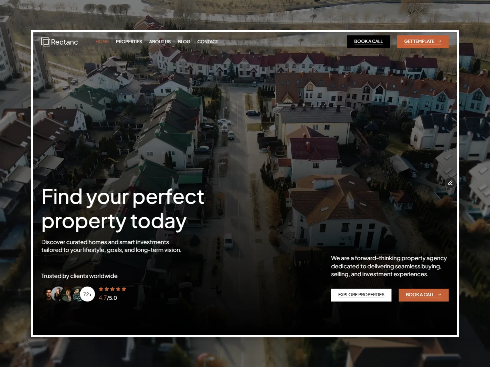
description: "Real estate website: a white page, black titles in Plus Jakarta Sans, soft grey panels with hairlines, black buttons that turn orange on hover and photos in 8px corners."
colors:
  ink: "#000000"
  white: "#ffffff"
  soft: "#525252"
  grey: "#8c8c8c"
  silver: "#b7b7b7"
  accent: "#eb5939"
  line: "#e8e8e8"
  snow: "#fafafa"
  danger: "#ff2244"
  ink-3: "rgba(0, 0, 0, 0.03)"
  ink-5: "rgba(0, 0, 0, 0.05)"
  ink-20: "rgba(0, 0, 0, 0.2)"
  ink-70: "rgba(0, 0, 0, 0.7)"
  ink-80: "rgba(0, 0, 0, 0.8)"
  white-60: "rgba(255, 255, 255, 0.6)"
  white-80: "rgba(255, 255, 255, 0.8)"
  danger-fill: "rgba(255, 34, 68, 0.15)"
  primary: "{colors.accent}"
  on-primary: "{colors.white}"
  secondary: "{colors.ink}"
  on-secondary: "{colors.white}"
  neutral: "{colors.white}"
  surface: "{colors.white}"
  on-surface: "{colors.ink}"
  on-surface-variant: "{colors.soft}"
  outline: "{colors.line}"
  error: "{colors.danger}"
typography:
  h1:
    fontFamily: "Plus Jakarta Sans"
    fontSize: "72px"
    fontWeight: 500
    lineHeight: 1.1
  number:
    fontFamily: "Plus Jakarta Sans"
    fontSize: "54px"
    fontWeight: 500
    lineHeight: 1.2
  h2:
    fontFamily: "Plus Jakarta Sans"
    fontSize: "44px"
    fontWeight: 500
    lineHeight: 1.2
  h3:
    fontFamily: "Plus Jakarta Sans"
    fontSize: "36px"
    fontWeight: 500
    lineHeight: 1.2
  h4:
    fontFamily: "Plus Jakarta Sans"
    fontSize: "32px"
    fontWeight: 500
    lineHeight: 1.2
  h5:
    fontFamily: "Plus Jakarta Sans"
    fontSize: "24px"
    fontWeight: 500
    lineHeight: 1.2
  h6:
    fontFamily: "Plus Jakarta Sans"
    fontSize: "20px"
    fontWeight: 500
    lineHeight: 1.2
  large:
    fontFamily: "Plus Jakarta Sans"
    fontSize: "18px"
    fontWeight: 400
    lineHeight: 1.4
  body:
    fontFamily: "Plus Jakarta Sans"
    fontSize: "16px"
    fontWeight: 400
    lineHeight: 1.4
  body-strong:
    fontFamily: "Plus Jakarta Sans"
    fontSize: "16px"
    fontWeight: 600
    lineHeight: 1.4
  small:
    fontFamily: "Plus Jakarta Sans"
    fontSize: "14px"
    fontWeight: 400
    lineHeight: 1.4
  caption:
    fontFamily: "Plus Jakarta Sans"
    fontSize: "12px"
    fontWeight: 400
    lineHeight: 1.4
  nav:
    fontFamily: "Plus Jakarta Sans"
    fontSize: "15px"
    fontWeight: 500
    lineHeight: 1.2
  button:
    fontFamily: "Inter"
    fontSize: "14px"
    fontWeight: 400
    lineHeight: 1.2
    letterSpacing: "0.05em"
  label:
    fontFamily: "Inter"
    fontSize: "12px"
    fontWeight: 400
    lineHeight: 1.2
  field:
    fontFamily: "Plus Jakarta Sans"
    fontSize: "12px"
    fontWeight: 400
    lineHeight: 1.2
rounded:
  pill: "50px"
  card: "8px"
  panel: "4px"
  cta: "20px"
spacing:
  gutter: "50px"
  gutter-phone: "20px"
  gutter-tablet: "30px"
  gutter-laptop: "40px"
  section-padding: "80px"
  section-padding-phone: "40px"
  section-padding-tablet: "60px"
  page-top: "40px"
  page-top-phone: "30px"
  page-top-tablet: "30px"
  status-padding: "120px"
  status-padding-phone: "60px"
  status-padding-tablet: "80px"
  status-padding-laptop: "100px"
  content-max: "1440px"
  header-height: "101px"
  header-height-phone: "70px"
  header-height-tablet: "91px"
  footer-gap: "80px"
  footer-gap-phone: "40px"
  footer-gap-tablet: "60px"
  block-gap: "50px"
  card-gap: "30px"
  title-gap: "80px"
  title-gap-phone: "40px"
  title-gap-tablet: "60px"
  text-max: "600px"
  form-max: "750px"
components:
  nav-link:
    textColor: "{colors.ink}"
    typography: "{typography.nav}"
    height: "20px"
  nav-link-hover:
    textColor: "{colors.ink}"
  pill-button:
    backgroundColor: "{colors.ink}"
    textColor: "{colors.white}"
    typography: "{typography.button}"
    rounded: "{rounded.pill}"
    padding: "12px 18px"
    height: "40.8px"
  pill-button-hover:
    backgroundColor: "{colors.accent}"
    textColor: "{colors.white}"
  pill-button-secondary:
    textColor: "{colors.ink}"
    typography: "{typography.button}"
    rounded: "{rounded.pill}"
    padding: "12px 18px"
    height: "40.8px"
  pill-button-secondary-hover:
    backgroundColor: "{colors.ink}"
    textColor: "{colors.white}"
  flip-button:
    backgroundColor: "{colors.ink}"
    textColor: "{colors.white}"
    typography: "{typography.button}"
    padding: "16px 24px"
    height: "48.8px"
  flip-button-hover:
    backgroundColor: "{colors.accent}"
    textColor: "{colors.white}"
  filter-chip:
    textColor: "{colors.ink}"
    typography: "{typography.label}"
    padding: "6px 8px"
    height: "26.4px"
  label-chip:
    textColor: "{colors.accent}"
    typography: "{typography.label}"
    rounded: "{rounded.pill}"
    padding: "6px 10px"
    height: "26px"
  text-link:
    textColor: "{colors.soft}"
    typography: "{typography.small}"
  text-link-hover:
    textColor: "{colors.accent}"
  load-more-button:
    backgroundColor: "{colors.ink}"
    textColor: "{colors.white}"
    typography: "{typography.button}"
    rounded: "{rounded.panel}"
    width: "150px"
    height: "40px"
  submit-button:
    backgroundColor: "{colors.ink}"
    textColor: "{colors.white}"
    typography: "{typography.label}"
    rounded: "{rounded.card}"
    padding: "0 16px"
    height: "40px"
  submit-button-hover:
    backgroundColor: "{colors.accent}"
    textColor: "{colors.white}"
  property-card:
    textColor: "{colors.ink}"
    typography: "{typography.h5}"
    rounded: "{rounded.card}"
  property-feature-card:
    textColor: "{colors.ink}"
    typography: "{typography.h3}"
    rounded: "{rounded.card}"
    padding: "20px"
  post-card:
    textColor: "{colors.ink}"
    typography: "{typography.h5}"
    rounded: "{rounded.card}"
  testimonial-card:
    textColor: "{colors.ink}"
    typography: "{typography.body}"
    rounded: "{rounded.card}"
    padding: "20px"
  agent-card:
    textColor: "{colors.ink}"
    typography: "{typography.h5}"
    rounded: "{rounded.panel}"
    padding: "30px"
  listing-filter:
    textColor: "{colors.ink}"
    typography: "{typography.h4}"
    rounded: "{rounded.panel}"
    padding: "30px"
  form-field:
    textColor: "{colors.ink}"
    typography: "{typography.field}"
    rounded: "{rounded.panel}"
    padding: "10px"
    height: "34.4px"
  slideshow-arrow:
    textColor: "{colors.white}"
    rounded: "{rounded.pill}"
    size: "40px"
---

# Goeboek Design System

> The design tokens and style rules of **Goeboek**, a website template by Marcframe (live Framer site: https://goeboek.framer.website). Read it before you build or change a page so new work matches the template. The front matter holds the exact values; the sections below say where and how to use them. Format: [DESIGN.md](https://github.com/google-labs-code/design.md), spec version `alpha`.

## Overview

Goeboek is a real estate template: a home page with a hero slideshow of properties, listings with a filter (all, by type, location, category and agent), a page for each property with its details, video, agent and a tour form, a blog, About, Contact and a form to submit a property. It should feel calm, bright and trustworthy, like a good estate agent's brochure: white space, large photos and clear prices.

The look is built from very few parts. The page is White; titles, prices and buttons are Black (#000000), longer texts and meta links Soft Black (#525252), quiet labels Grey (#8c8c8c). Panels — the hero card, the agent card, the filter, the post sidebar boxes, testimonial cards and form fields — are the same surface: Black at 3 % with a 1px Black 5 % hairline drawn inside. Dividers and the top edge of bordered sections are Line (#e8e8e8); the footer is Snow (#fafafa). The one accent, Accent (#eb5939), writes the label chips, fills a hovered button and marks every hovered link.

Two families carry it: Plus Jakarta Sans at weight 500 for every heading and 400 for text, and Inter in capitals only for buttons, chips, tags and ratings. Motion is one stiff spring for every hover and state change (button fills, a label that rolls up, a two-tone face that flips, the header links' underline, a post photo settling from 105 %), and slideshows: the hero's properties every 8 s, its testimonials every 4 s and a hovered property card's photos every 1.5 s. Nothing appears on scroll and nothing counts up.

## Colors

- **Ink (#000000)** — `ink`, `secondary`, `on-surface`. Black: titles, body text of posts and quotes, the header links and their line, the buttons' resting fill, labels on White.
- **White (#ffffff)** — `white`, `on-primary`, `on-secondary`, `neutral`, `surface`. White: the page, the header bar, labels on Black and Accent buttons, the CTA title.
- **Soft (#525252)** — `soft`, `on-surface-variant`. Soft Black: section texts, card excerpts, meta links, field labels, footer links and texts, the pressed submit button.
- **Grey (#8c8c8c)** — `grey`. Grey: the hero stat labels, the agent caption, field placeholders, the 404 number.
- **Silver (#b7b7b7)** — `silver`. Light grey: the text on the dark CTA photo.
- **Accent (#eb5939)** — `accent`, `primary`. Accent (orange): label chips' text, hovered links, the buttons' hover fill, the stat plus, a focused or failed field's border, the checked radio ring.
- **Line (#e8e8e8)** — `line`, `outline`. Line: dividers, the top border of bordered sections, the card rules, the agent card's rows.
- **Snow (#fafafa)** — `snow`. Snow: the footer's fill.
- **Danger (#ff2244)** — `danger`, `error`. Danger: the label of a submit button whose sending failed.
- **Ink 3 (rgba(0, 0, 0, 0.03))** — `ink-3`. Black 3 %: panels (the hero card, the post sidebar boxes, the agent card, the filter), testimonial cards, the List chips, form fields and radios.
- **Ink 5 (rgba(0, 0, 0, 0.05))** — `ink-5`. Black 5 %: label chips' fill, the 1px hairline inside panels, cards and fields, the agent photo placeholder.
- **Ink 20 (rgba(0, 0, 0, 0.2))** — `ink-20`. Black 20 %: the veil over property photos, the radio border, the hero dots' backdrop, the filter's More lines.
- **Ink 70 (rgba(0, 0, 0, 0.7))** — `ink-70`. Black 70 %: the veil over the CTA photo.
- **Ink 80 (rgba(0, 0, 0, 0.8))** — `ink-80`. Black 80 %: the hero slideshow's round arrows.
- **White 60 (rgba(255, 255, 255, 0.6))** — `white-60`. White 60 %: the type tag on property photos and the date tag on the post cover.
- **White 80 (rgba(255, 255, 255, 0.8))** — `white-80`. White 80 %: the agent's name chip on a hovered property card.
- **Danger fill (rgba(255, 34, 68, 0.15))** — `danger-fill`. Danger 15 %: the fill of a submit button whose sending failed.

Semantic names in the front matter point at these colours: `primary` → `accent`, `on-primary` → `white`, `secondary` → `ink`, `on-secondary` → `white`, `neutral` → `white`, `surface` → `white`, `on-surface` → `ink`, `on-surface-variant` → `soft`, `outline` → `line`, `error` → `danger`.

## Typography

**Plus Jakarta Sans, sans-serif.** Plus Jakarta Sans, the variable font (OFL; weights 400, 500, 600 and 700 in use): every heading, text, link, field and the header links.

Font sizes change at the breakpoints (phone / tablet from 810px / laptop from 1200px / desktop from 1440px); the front matter gives the desktop size. Line height is a multiple of the font size.

| Token | Size (phone / tablet / laptop / desktop) | Line height | Weight | Letter spacing | Use |
|---|---|---|---|---|---|
| `h1` | 38px / 48px / 64px / 72px | 1.1 | 500 | — | Heading 1: the Home hero title |
| `number` | 36px / 42px / 46px / 54px | 1.2 | 500 | — | Number: the hero stats and the page titles of Blog, About, Contact, Add property, the success pages and the 404 |
| `h2` | 32px / 34px / 38px / 44px | 1.2 | 500 | — | Heading 2: section titles, the post title, the Contact address, the CTA title |
| `h3` | 28px / 30px / 34px / 36px | 1.2 | 500 | — | Heading 3: the About section titles, the hero card's property title |
| `h4` | 26px / 28px / 30px / 32px | 1.2 | 500 | — | Heading 4: the hero card's figures, the filter title, the Contact form's call to action |
| `h5` | 20px / 22px / 24px / 24px | 1.2 | 500 | — | Heading 5: card titles, sidebar box titles, the About values, the Contact columns, the subtitles of the success pages and the 404, the agent's name |
| `h6` | 18px / 19px / 20px / 20px | 1.2 | 500 | — | Heading 6: footer column titles, card prices, the filter group titles, the Add property group titles and its Message label |
| `large` | 18px | 1.4 | 400 | — | Large text: the page title leads (About, Contact), the hero lead, "Contact Details" |
| `body` | 16px | 1.4 | 400 | — | Text: section texts, card excerpts, quotes, post and property texts (bold runs 700) |
| `body-strong` | 16px | 1.4 | 600 | — | Text semibold: the values of the property page's detail and utility rows |
| `small` | 14px | 1.4 | 400 | — | Small text: dates on cards, meta links, names, field labels, footer texts and links ("Follow us:" 700), the sidebar texts |
| `caption` | 12px | 1.4 | 400 | — | Caption: the date of a small post card, "More Details", radio texts, field units, field errors |
| `nav` | 15px | 1.2 | 500 | —, uppercase | Menu: the header links and the Menu / Close label |
| `button` | 14px | 1.2 | 400 | 0.05em, uppercase | Button (Inter): the pill and flip buttons, Load More |
| `label` | 12px | 1.2 | 400 | —, uppercase | Label (Inter): label chips, the type and date tags, ratings, small pills, the filter chips, the submit buttons, the post's author line |
| `field` | 12px | 1.2 | 400 | — | Field: what is typed in inputs, selects and text areas, and their placeholders (Grey) |

## Layout

Four layouts: phone below 810px, tablet from 810px, laptop from 1200px, desktop from 1440px. Spacing tokens without a suffix are the desktop values; `-laptop`, `-tablet` and `-phone` give the smaller screens where they differ.

| Token | Phone / tablet / laptop / desktop | Use |
|---|---|---|
| `gutter` | 20px / 30px / 40px / 50px | Side padding of every section, the header and the footer |
| `section-padding` | 40px / 60px / 80px / 80px | Top and bottom padding of a regular section |
| `page-top` | 30px / 30px / 40px / 40px | Top padding of the first section of Blog, Post, About, Contact and Add property (the bottom is sectionPadding; Contact's title section keeps 40 at the bottom on phones) |
| `status-padding` | 60px / 80px / 100px / 120px | Top and bottom padding of the success pages and the 404 |
| `content-max` | 1440px | The inner column of every section, the header and the footer; centred beyond |
| `header-height` | 70px / 91px / 101px / 101px | The sticky header: padding 20 / 25 × 30 / 30 × 40 / 30 × 50 around a 30 / 40.8 / 40.8 / 40.8 tall row (70 / 90.8 / 100.8 / 100.8 in all) |
| `footer-gap` | 40px / 60px / 80px / 80px | Space between the last section and the footer's fill |
| `block-gap` | 50px | Between a section title and its grid, between the rows of the success pages and the 404, between the post's blocks |
| `card-gap` | 30px | Between cards in a grid (rows and columns) and between the small post cards |
| `title-gap` | 40px / 60px / 80px / 80px | Between a page title and its photo or map, and between the About and testimonial titles and their content |
| `text-max` | 600px | The centred text blocks of the success pages and the 404, the Add property title |
| `form-max` | 750px | The Add property column |

Every page is a stack of full-width sections under the sticky header: `section-padding` above and below each (40 / 60 / 80 / 80), `gutter` at the sides (20 / 30 / 40 / 50), the content at most `content-max` (1440) wide and centred. A section title sits `block-gap` (50) above its grid, and cards are `card-gap` (30) apart in rows and columns: one column on phones, two on tablets, three from 1200 and four posts from 1440. The first block of Blog, Post, About, Contact and Add property starts `page-top` under the header; the success pages and the 404 use `status-padding` and a centred column of `text-max`.

The listing pages, the property page and the post put a main column and a sidebar side by side from 1200 (the sidebar 375, 400 from 1440), with a 1px Line between them as tall as the row; below 1200 they stack with a Line across. The header is a sticky White bar of `header-height`; it never changes with the scroll, and on phones a Menu button opens the links and the two buttons under the logo. The footer is a Snow block `footer-gap` below the last section.

## Elevation & Depth

Goeboek is flat: there are no shadows. Depth comes from the panel surface (Black 3 % with a Black 5 % hairline drawn inside) on the White page, from photos under a Black 20 % veil, and from the call-to-action block, a photo under a Black 70 % veil with White and Light grey text.

## Shapes

Corners are small and graded: photos, the hero card, testimonial cards and the submit button 8 (`card`), panels, form fields and the Load More button 4 (`panel`), the call-to-action photo 20 (`cta`). Pill buttons and label chips are fully round (`pill`), and so are agent and client photos. Flip buttons and the type tag on a photo are square.

- **`pill` (50px):** Pill buttons, label chips, round photos.
- **`card` (8px):** Photos, the hero card's panel, testimonial cards, the submit button, the slideshow photos.
- **`panel` (4px):** The agent card, the filter, the post sidebar boxes, form fields, the Load More button.
- **`cta` (20px):** The CTA photo.

## Motion

Reduced motion: no slideshow plays by itself, labels and flip buttons change without rolling, the filter and the phone menu open at once and the submit button's ring stands still; colour changes still fade.

- **`spring`** — spring (stiffness 500, damping 60, mass 1). Every hover and state change (pill and flip buttons, the label roll, the nav line, the post photo zoom, the agent chip, the filter, the menu icon); never overshoots, settles in about 0.7 s. As a CSS curve: linear(0, 0.096, 0.257, 0.409, 0.535, 0.636, 0.715, 0.777, 0.826, 0.864, 0.893, 0.917, 0.935, 0.949, 0.96, 0.969, 0.976, 0.981, 0.985, 0.988, 0.991, 0.993, 0.994, 0.996, 0.997, 0.997, 0.998, 0.998, 0.999, 1) over 714ms.
- **`menu-spring`** — spring (duration 0.3 s, bounce 0). The phone header opening and closing.
- **`slide-spring`** — spring (stiffness 200, damping 40, mass 1). One step of a slideshow (the hero, the hero testimonials, a hovered property card's photos).
- **`slide-interval`** — hero 8s (the hero's featured properties); testimonials 4s (the hero's testimonials); cardPhotos 1.5s (a hovered property card's photos). Time between two slideshow steps; slideshows stand still with reduced motion and play only while on screen.
- **`ease-form`** — `cubic-bezier(0.44, 0, 0.56, 1)`. The submit buttons' fill on hover and press, over 0.2 s.
- **`spinner`** — turn 1s. The submit buttons' sending ring: one turn a second, linear, for ever.

## Components

Component tokens below use the exact values of the template. Variants with a suffix (`-hover`) only list what changes. Translucent fills (Black 3 %, Black 5 %, White 60 % and 80 %, Danger 15 %) are described in the notes, not as colours. Hairlines are drawn inside the box and never change its size.

- **`nav-link`** (Nav link). A header link in capitals, 30 apart on one line, over a 1px Black line at its bottom edge that is 0 wide at rest.
- **`nav-link-hover`** (Nav link). The line grows to the full width from the left with the spring; leaving takes it away at once.
- **`pill-button`** (Pill button). The primary pill ("Add Property", "Request a tour", "More about Us"): a Black hairline inside; on hover its label rolls up one line and a copy rolls in.
- **`pill-button-hover`** (Pill button). Accent fill and hairline, with the spring.
- **`pill-button-secondary`** (Pill button). "Contact us" in the header: no fill, a Black hairline inside.
- **`pill-button-secondary-hover`** (Pill button). Black fill, the label White.
- **`flip-button`** (Flip button). A square button ("See all Property", "Contact Sales", "Back to Homepage") whose face is a block twice its height: the resting face over the hover face, each with its own fill and label.
- **`flip-button-hover`** (Flip button). The block moves up one face with the spring; the call-to-action block's buttons flip to White with a Black label instead.
- **`filter-chip`** (Flip button). The `list` flip button of the listing filter ("Sell", "Brooklyn", "Houses"): Black 3 % with a Black 5 % hairline; it flips to Accent with a White label on hover.
- **`label-chip`** (Label chip). Above a section title and on cards ("About Goeboek", "For Rent"): Black 5 % fill, as wide as its text.
- **`text-link`** (Text link). An inline link in the text style of its line: Soft Black for meta and footer links, Black for card titles and names, Grey for listing links.
- **`text-link-hover`** (Text link). Accent and underlined 0.15 em below the text, at once (no transition); a Grey link turns Black.
- **`load-more-button`** (Load More button). Under a paged list of properties, centred at the bottom of the 100 below it; no hover change.
- **`submit-button`** (Submit button). The full-width last control of every form: Soft Black while pressed (0.2 s, `ease-form`); a turning 20 ring while sending, then "Thank you" on Accent or, on a Danger 15 % fill, "Something went wrong" in Danger.
- **`submit-button-hover`** (Submit button). At rest only; no hover while sending or after the answer.
- **`property-card`** (Property card). A photo at 1.536 : 1 under a Black 20 % veil with the type tag (White 60 %, square) at its left edge, then the meta (a map pin, the category and location), the title, a two-line excerpt in `body` Soft Black, a Line and the price row (price in `h6`, size, beds and baths with 20 icons); on hover the agent's chip slides in and the photos step every 1.5 s.
- **`property-feature-card`** (Property feature card). The hero's slide: the photo beside a panel (Black 3 %) with the meta, the title, beds, bath and size in `h4`, the price line, the agent box from 1200 and "Request a tour".
- **`post-card`** (Post card). A photo at 0.84 : 1 drawn 105 % large, the date in `small`, the title and a three-line excerpt in `body` Soft Black; on hover the photo settles to 100 % with the spring.
- **`testimonial-card`** (Testimonial card). On About: Black 3 % with a hairline, the whole quote, then the client's 24 round photo and name in `small` with a star and the score in `label` at the right; in the Home hero the same without the panel, the quote cut at three lines.
- **`agent-card`** (Agent card). A panel (Black 3 %, a hairline inside): the agent's round photo (72, 82 from 1200), name and address, the phones, WhatsApp and e-mail between 1px Lines, then the agent's text or a full-width "Contact Sales" flip button.
- **`listing-filter`** (Listing filter). A panel with "Explore: All", a lead in `small` Soft Black and the Type, Category, Location and Agents groups of filter chips; on phones it folds behind a "More" row with a round Black caret button.
- **`form-field`** (Field). Black 3 % fill and a 1px Black 5 % border drawn inside that turns Accent on focus and after a failed check (the message under it in `caption` Accent); the label in `small` Soft Black 10 above; placeholders Grey; the message box 250 tall.
- **`slideshow-arrow`** (Slideshow). Two round Black 80 % buttons with a white chevron, 20 in from the sides of the hero slideshow, shown only while the pointer is over it; White dots below, the current one full.

Other components of the template, described in its spec: Section, Divider, Section title, Logo, Menu button, Header, Footer, Roll label, Stat, Rating, Property meta, Rich text, Load More list, Radio group, Form behaviour.

## Do's and Don'ts

- Do keep the page White and build every panel, card box and field from the same surface: Black 3 % with a Black 5 % hairline drawn inside.
- Do set headings and text in Plus Jakarta Sans (500 for headings, 400 for text) and keep Inter in capitals for buttons, chips, tags and ratings only.
- Do use Black for titles, prices and buttons, Soft Black for longer texts and meta links, Grey for quiet labels.
- Do turn hovered buttons and links Accent, with the stiff spring for fills, rolling labels and flipping faces.
- Do show photos large in 8px corners, cropped to their frame, with the property card's type tag and veil.
- Do put a sidebar beside the main column from 1200 with a 1px Line between them, and stack it below on smaller screens.
- Don't add drop shadows or gradients: depth is the translucent panel, its hairline and the photos.
- Don't use Accent for large fills or body text: it is for chips, hovers and the stat plus.
- Don't round buttons other than the pills: flip buttons and the type tag are square, panels and fields 4.
- Don't use Inter for headings or text, or Plus Jakarta Sans in capitals for buttons.
- Don't animate anything on scroll or count numbers up: the motion is hover, the slideshows, the filter and the menu.

## Source

Every value here was measured from the published Goeboek template (https://goeboek.framer.website); when this file and the live site disagree, the site is right.

Demo photos (Unsplash, Pexels or the owner's) are placeholders and not part of the design system; the logo mark and the two success drawings are the template's own.

This DESIGN.md is licensed under [CC BY 4.0](https://creativecommons.org/licenses/by/4.0/): use and adapt it freely, with credit to Framebrick. The template itself (its pages, code and images) is covered by the Framebrick license: https://framebrick.co/license
Use it with your agent
Save it as DESIGN.md at your project’s root. Ask Claude Code, Cursor, v0 or Lovable to follow it for every page and component it builds. Or let the agent fetch it: the Framebrick MCP server’s get_design_md tool with { "slug": "goeboek" }, or the raw file at framebrick.co/templates/goeboek/design.md . Connect the MCP server