DESIGN.md Tailwind v4 CSS variables
---
version: "alpha"
name: "Fitbricks"
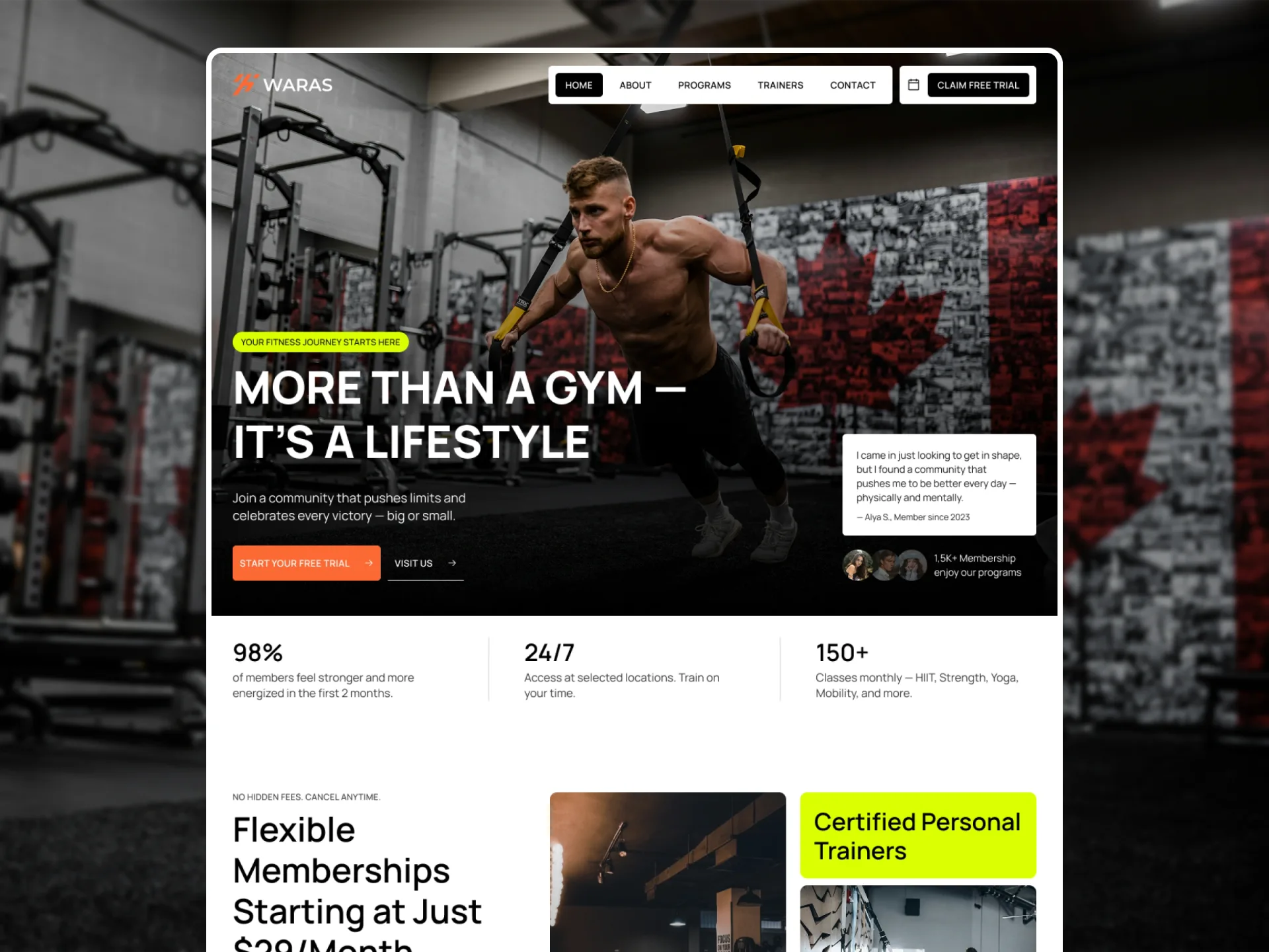
description: "Gym and fitness website: a white page, black type, an Orange call to action, Lime eyebrow pills and hover fills, photo cards under dark gradients, Manrope throughout."
colors:
  black: "#000000"
  white: "#FFFFFF"
  lime: "#DBFF02"
  orange: "#FD6934"
  danger: "#FF2244"
  focus: "#0099FF"
  spinner: "#999999"
  primary: "{colors.orange}"
  on-primary: "{colors.white}"
  secondary: "{colors.black}"
  on-secondary: "{colors.white}"
  tertiary: "{colors.lime}"
  on-tertiary: "{colors.black}"
  neutral: "{colors.white}"
  surface: "{colors.white}"
  on-surface: "{colors.black}"
  error: "{colors.danger}"
typography:
  display:
    fontFamily: "Manrope"
    fontSize: "64px"
    fontWeight: 800
    lineHeight: 1.2
  h1:
    fontFamily: "Manrope"
    fontSize: "56px"
    fontWeight: 600
    lineHeight: 1.2
  h2:
    fontFamily: "Manrope"
    fontSize: "48px"
    fontWeight: 600
    lineHeight: 1.2
  h3:
    fontFamily: "Manrope"
    fontSize: "34px"
    fontWeight: 600
    lineHeight: 1.2
  h4:
    fontFamily: "Manrope"
    fontSize: "28px"
    fontWeight: 600
    lineHeight: 1.2
  h5:
    fontFamily: "Manrope"
    fontSize: "24px"
    fontWeight: 600
    lineHeight: 1.2
  h6:
    fontFamily: "Manrope"
    fontSize: "20px"
    fontWeight: 600
    lineHeight: 1.2
  label:
    fontFamily: "Manrope"
    fontSize: "12px"
    fontWeight: 500
    lineHeight: 1.1
    letterSpacing: "0.03em"
  button:
    fontFamily: "Manrope"
    fontSize: "13px"
    fontWeight: 600
    lineHeight: 1.1
    letterSpacing: "0.03em"
  large:
    fontFamily: "Manrope"
    fontSize: "18px"
    fontWeight: 400
    lineHeight: 1.4
  body:
    fontFamily: "Manrope"
    fontSize: "16px"
    fontWeight: 400
    lineHeight: 1.4
  small:
    fontFamily: "Manrope"
    fontSize: "14px"
    fontWeight: 400
    lineHeight: 1.4
  caption:
    fontFamily: "Manrope"
    fontSize: "12px"
    fontWeight: 400
    lineHeight: 1.2
rounded:
  menu: "4px"
  button: "5px"
  card: "10px"
  pill: "50px"
spacing:
  gutter: "30px"
  gutter-phone: "15px"
  gutter-tablet: "20px"
  section-padding: "100px"
  section-padding-phone: "60px"
  section-padding-tablet: "80px"
  page-top: "50px"
  page-top-phone: "30px"
  page-top-tablet: "40px"
  block-gap: "50px"
  grid-gap: "20px"
  content-max: "1440px"
  sidebar: "350px"
  header: "94px"
  header-phone: "70px"
components:
  button:
    backgroundColor: "{colors.orange}"
    textColor: "{colors.white}"
    typography: "{typography.button}"
    rounded: "{rounded.button}"
    padding: "18px 24px"
    height: "50.3px"
  button-black:
    backgroundColor: "{colors.black}"
    textColor: "{colors.white}"
  button-white:
    backgroundColor: "{colors.white}"
    textColor: "{colors.black}"
  nav-button:
    textColor: "{colors.black}"
    typography: "{typography.button}"
    rounded: "{rounded.menu}"
    padding: "10px 14px"
    height: "34.3px"
  nav-button-black:
    backgroundColor: "{colors.black}"
    textColor: "{colors.white}"
  eyebrow:
    backgroundColor: "{colors.lime}"
    textColor: "{colors.black}"
    typography: "{typography.label}"
    rounded: "{rounded.pill}"
    padding: "8px 12px"
    height: "29.2px"
  card-action:
    backgroundColor: "{colors.white}"
    textColor: "{colors.orange}"
    typography: "{typography.button}"
    rounded: "{rounded.button}"
    padding: "12px 18px"
    height: "38.3px"
  club-card:
    textColor: "{colors.white}"
    typography: "{typography.h5}"
    rounded: "{rounded.card}"
    padding: "20px"
    height: "400px"
  program-card:
    textColor: "{colors.white}"
    typography: "{typography.h5}"
    rounded: "{rounded.card}"
    padding: "20px"
    height: "300px"
  trainer-card:
    textColor: "{colors.white}"
    typography: "{typography.h5}"
    rounded: "{rounded.card}"
    padding: "20px"
  post-card:
    textColor: "{colors.black}"
    typography: "{typography.h6}"
    rounded: "{rounded.card}"
  category-link:
    textColor: "{colors.black}"
    typography: "{typography.small}"
    rounded: "{rounded.button}"
  pricing-card:
    textColor: "{colors.black}"
    typography: "{typography.h3}"
    rounded: "{rounded.card}"
    padding: "20px"
  check-list:
    backgroundColor: "{colors.lime}"
    textColor: "{colors.black}"
    typography: "{typography.body}"
    size: "22px"
  form-field:
    textColor: "{colors.black}"
    typography: "{typography.body}"
    rounded: "{rounded.button}"
    padding: "12px"
    height: "40px"
  submit-button:
    backgroundColor: "{colors.black}"
    textColor: "{colors.white}"
    typography: "{typography.button}"
    rounded: "{rounded.button}"
    height: "40px"
  accordion:
    backgroundColor: "{colors.white}"
    textColor: "{colors.black}"
    typography: "{typography.h6}"
    padding: "30px 20px 0px 20px"
---

# Fitbricks Design System

> The design tokens and style rules of **Fitbricks**, a website template by Framebrick (live Framer site: https://fitbricks.framer.website). Read it before you build or change a page so new work matches the template. The front matter holds the exact values; the sections below say where and how to use them. Format: [DESIGN.md](https://github.com/google-labs-code/design.md), spec version `alpha`.

## Overview

Fitbricks is a website template for gyms and fitness clubs: programs with plans and videos, clubs in every city with a booking form, trainers, a blog, a free-trial form and contact. It should feel energetic and direct: big full-window photos, bold headings, an Orange button wherever there is something to do, and photo cards that reveal their action on hover.

The page is White (#FFFFFF) with Black (#000000) type; secondary copy is Black at 80%, and translucent Black draws the pale surfaces (Black 5 form panels and fields, Black 10 chips and pale cards). Orange (#FD6934) is the call to action — the main buttons, the card actions' labels and the hover of every dark chip — and Lime (#DBFF02) marks a page title's eyebrow pill, the feature blocks, the list ticks and the hover fill of the category links. Photos that carry White text sit under the `cover` gradient (clear at the top, Black at the bottom).

Everything is set in Manrope: headings 600 at line height 1.2, the Home hero's title 800 in capitals, labels and buttons 500 / 600 in capitals with 0.03em tracking, text 400 at 1.4. Motion is lively but short: springs of 0.4 s with a slight bounce on buttons and chips, card actions rising in from below the card on hover, post photos zooming to 105%, and on Home alone blocks rising 18px into place on scroll and a ticker of member stories.

## Colors

- **Black (#000000)** — `black`, `secondary`, `on-tertiary`, `on-surface`. Text, the dark buttons and menu chips, the footer, the social circles. Translucent uses: Black 80 body copy beside titles, Black 60 the program card veil, Black 40 hairlines in rows (the post and club crumbs, the trainer name rule, the FAQ rules), Black 20 the column rules and the category link border, Black 10 the city chips and the pale cards, Black 5 the form panels, the pricing cards and the form fields.
- **White (#FFFFFF)** — `white`, `on-primary`, `on-secondary`, `neutral`, `surface`. The page, the header panels, the card actions, the date tag, text on photos (White 80 the 404 sentence and the footer links, White 30 the Instagram chip).
- **Lime (#DBFF02)** — `lime`, `tertiary`. The eyebrow pills of the page titles, the feature blocks, the list ticks, the hover fill of the category links and the sidebar program links.
- **Orange (#FD6934)** — `orange`, `primary`. The main buttons, the card actions' labels, every menu chip and social circle on hover, the checked radio.
- **Danger (#FF2244)** — `danger`, `error`. The submit button's error label; at 15% its fill.
- **Focus (#0099FF)** — `focus`. The border of a focused form field.
- **Spinner (#999999)** — `spinner`. The ring of the list loader (lists that load on scroll).
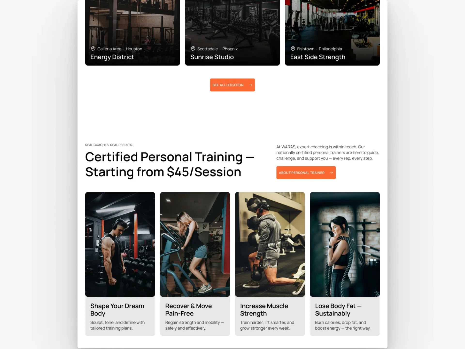
- **Gradient `cover`:** `linear-gradient(180deg, rgba(0, 0, 0, 0) 0%, rgba(0, 0, 0, 0.5) 50%, #000000 100%)`. Cover — over every photo that carries white text at its bottom (club, trainer and testimonial cards, the 404): clear at the top, Black 50 at the middle, Black at the bottom.
- **Gradient `cta-veil`:** `linear-gradient(180deg, rgba(255, 255, 255, 0) 0%, rgba(0, 0, 0, 0.8) 49.72%, #000000 100%)`. CTA Veil — over the call-to-action band's photo.

Semantic names in the front matter point at these colours: `primary` → `orange`, `on-primary` → `white`, `secondary` → `black`, `on-secondary` → `white`, `tertiary` → `lime`, `on-tertiary` → `black`, `neutral` → `white`, `surface` → `white`, `on-surface` → `black`, `error` → `danger`.

## Typography

**Manrope, sans-serif.** Manrope, the only typeface. Weights 400 (paragraphs), 500 (labels), 600 (headings, buttons), 700 (bold runs in rich text) and 800 (the display title).

Font sizes change at the breakpoints (phone / tablet from 810px / desktop from 1200px); the front matter gives the desktop size. Line height is a multiple of the font size.

| Token | Size (phone / tablet / desktop) | Line height | Weight | Letter spacing | Use |
|---|---|---|---|---|---|
| `display` | 38px / 50px / 64px | 1.2 | 800 | —, uppercase | Display — the Home hero's title |
| `h1` | 34px / 44px / 56px | 1.2 | 600 | — | Heading 1 — the title of every page but Home (Clubs, a club, a city, Trainers, a trainer, Contact, Blog, a post, a legal page, the 404) |
| `h2` | 32px / 38px / 48px | 1.2 | 600 | — | Heading 2 — section titles (Other Club Location, Find Your Nearest Club, the trainers band, My Fitness Programs, Other Trainers, the FAQ, Related Articles) |
| `h3` | 26px / 30px / 34px | 1.2 | 600 | — | Heading 3 — the club page's block titles, level-3 headings in a post or legal body, the feature blocks, prices |
| `h4` | 24px / 26px / 28px | 1.2 | 600 | — | Heading 4 — form titles (Get in Touch), level-4 headings in a post body |
| `h5` | 22px / 23px / 24px | 1.2 | 600 | — | Heading 5 — card titles (clubs, programs, trainers), sidebar titles (Book Your Class Now, More in …, Recent posts), the contact blocks' titles, a trainer's summary |
| `h6` | 18px / 19px / 20px | 1.2 | 600 | — | Heading 6 — post card titles, facility names, the FAQ questions, the contact rows' labels |
| `label` | 12px | 1.1 | 500 | 0.03em, uppercase | Label — eyebrows, post card meta (category and date) |
| `button` | 13px | 1.1 | 600 | 0.03em, uppercase | Button — button and menu labels, card actions, the program card's category, the post's date tag, the trainer page's contact labels |
| `large` | 18px | 1.4 | 400 | — | Large — the hero lead, program levels, the 404 sentence, the sidebar program and category links |
| `body` | 16px | 1.4 | 400 | — | Body — section texts, card texts, excerpts, rich text, the club and contact rows |
| `small` | 14px | 1.4 | 400 | — | Small — card locations, form labels, facility texts, a trainer's role, the trainer card's summary, quotes |
| `caption` | 12px | 1.2 | 400 | — | Caption — the hero quote's author |

## Layout

Three layouts: phone below 810px, tablet from 810px, desktop from 1200px. Spacing tokens without a suffix are the desktop values; `-tablet` and `-phone` give the smaller screens where they differ.

| Token | Phone / tablet / desktop | Use |
|---|---|---|
| `gutter` | 15px / 20px / 30px | Side padding of every section, the header and the footer |
| `section-padding` | 60px / 80px / 100px | Vertical padding of a section (and the bottom padding of a page's first block) |
| `page-top` | 30px / 40px / 50px | Top padding of a page's first block under the header (the lists, a club, Contact, Blog, a post, a legal page); a trainer's profile has it above and below |
| `block-gap` | 50px | Between the blocks of a section (a title and its grid, a grid and its button) |
| `grid-gap` | 20px | Between photo cards in a grid (clubs, programs, trainers); post grids use 30 |
| `content-max` | 1440px | Widest content column, centred inside the gutters (1452 wide at 1512 is capped to 1440; 1920 starts it at x 240) |
| `sidebar` | 350px | The sidebar beside the main column on a club page and a post (desktops), 50 apart on each side of a 1px rule |
| `header` | 70px / 94px / 94px | Height of the fixed header; the page starts under it unless its first block is a full-bleed photo |

Every page is a column of full-width bands on White with no gaps between them, the content centred and at most `content-max` (1440px) wide inside the `gutter` on each side — so it keeps growing above 1200px. A band is padded by `section-padding` above and below; a page's first block under the header has `page-top` above it. Blocks inside a band stand `block-gap` apart; photo cards in a grid `grid-gap` apart (post grids 30px). A club page and a post put a `sidebar`-wide column beside the main column on desktops, 50px on each side of a 1px Black 20 rule. The header is a bar fixed at the top of the window (`header` tall): transparent over the full-window photos of Home, Free trial, the programs and the 404, White with the dark logo everywhere else.

## Elevation & Depth

Fitbricks is flat: no shadows anywhere. Depth comes from photos and translucent Black: the `cover` gradient under the White text of club, trainer and testimonial cards and the 404, a Black 60 veil on program cards, `cta-veil` on the call-to-action band, and Black 5 / Black 10 panels that sit on the White page. The header's White panels float over the hero photo without a shadow; Instagram tiles carry a frosted White 30 chip (blur 8).

## Shapes

Corners are soft and consistent: 10px for cards, photos, form panels and sidebar panels; 5px for buttons, card actions, form fields, the header's panels and the category links; 4px for menu chips and the category symbol; 50px pills for eyebrows, the duration pill and the social circles. Radios and the list ticks are round.

- **`menu` (4px):** Menu chips (header links, the city filter), the program card's category symbol.
- **`button` (5px):** Buttons, card actions, form fields and the submit button, the header panels, category links.
- **`card` (10px):** Cards, photos, form panels, sidebar panels.
- **`pill` (50px):** Eyebrow pills, the duration pill, the social circles.

## Motion

Read from the published site's component modules (2026-11-05) and checked with real input. Hovers apply to pointer devices from 1200 up where a card has a desktop variant; tablets and phones show the cards' revealed state.

Reduced motion: hover effects and state changes happen at once, the rises jump into place and the Home reveals fade without moving, the ticker stops, the menus and the FAQ open at once, and the loading ring stands still; the hero's quotes still change every 4 s.

- **`spring`** — spring (duration 0.4 s, bounce 0). Spring — the header's panel and colours, the FAQ answer's height, the hero's word reveal.
- **`spring-bounce`** — spring (duration 0.4 s, bounce 0.2). Spring Bounce — the buttons' fade and arrow, the menu chips' fill, the hamburger, the Instagram chip, the social circles, the category links' fill, the Read more underline.
- **`press`** — spring (duration 0.45 s, bounce 0.25). Press — a card action scaling to 0.95 under the pointer, the trainer card's action going from 80% to full opacity.
- **`ease-in-out`** — `cubic-bezier(0.44, 0, 0.56, 1)`. Ease In Out — the card actions and panels rising into place (0.4 s), the testimonial quote fade (0.4 s), the sidebar program links (0.4 s), form states (0.2 s), the list loader's fade (0.3 s).
- **`ease-zoom`** — `cubic-bezier(0.12, 0.23, 0.5, 1)`. Ease Zoom — the post cards' photo zoom (0.4 s).
- **`rise`** — type tween, duration 0.4s, ease `ease-in-out`. Rise — a card's action (club, program) or panel (trainer) moving in from below the card's edge on hover, pushing the text up.
- **`form-state`** — type tween, duration 0.2s, ease `ease-in-out`. The submit button's fill and label changes; its spinner turns once a second, linear.
- **`appear`** — spring (stiffness 320, damping 55, mass 1, delay 0.05 s). Appear — Home's scroll reveals: from 18px below at opacity 0, once half the block is in view.
- **`hero-rise`** — spring (stiffness 400, damping 58, mass 1). Hero Rise — the Home hero's blocks on load, from 7px below (badge after 0.35 s, buttons and quote after 0.65 s).
- **`quote`** — type tween, duration 0.4s, ease 0.5,0,0.88,0.77, every 4s. The Home hero's quote: the next one every 4 s; the photos reorder with this tween.
- **`ticker`** — speed 20px/s, pauseOnHover true. The Home testimonials' ticker on desktops.

## Components

Component tokens below use the exact values of the template. Variants with a suffix only list what changes; translucent fills (Black 5 fields and panels, Black 10 chips, Black 60 and gradient veils, Danger 15, White 30 chips) are described in the notes.

- **`button`** (Button). Every main call to action ("Start Your Free Trial", "Show on map", "Contact us"): the label on one line and, 10px to its right, the 14px arrow. Hover (`spring-bounce`): the button fades to 90% and the arrow slides 2px to the right.
- **`button-black`** (Button). The secondary call to action on White bands.
- **`button-white`** (Button). On dark photos.
- **`nav-button`** (NavButton). The header's page links in a White panel (padding 10, corners 5), and the city filter (on Black 10). Hover (`spring-bounce`): the chip fills Orange and the label turns White. The current page's chip is Black with a White label.
- **`nav-button-black`** (NavButton). "Claim free trial", the header's action, in its own White panel; Orange on hover.
- **`eyebrow`** (Eyebrow). A page title's eyebrow pill ("30+ Clubs in 10 Cities"), 10px above the h1. Section titles use the same Label with no pill.
- **`card-action`** (CardAction). "See Details" with the 14px arrow, both Orange, inside club and program cards. Desktops: it waits below the card's edge and rises in on hover (`rise`), pushing the text up; it scales to 0.95 under the pointer (`press`). Tablets and phones always show it.
- **`club-card`** (ClubCard). A club as one link: the photo under the `cover` gradient, the map pin, area and city (`small`) over the name at the bottom, then the card action.
- **`program-card`** (ProgramCard). A program as one link: the photo under a Black 60 veil; the category's 40px symbol (its own colour, corners 4) and name at the top; the name, the dumbbell and level (`large`) and a White duration pill at the bottom, then the card action.
- **`trainer-card`** (TrainerCard). A portrait at 0.64 : 1 under the `cover` gradient, the name over the role, centred; a White panel (corners 10, padding 10) with the summary and an Orange "See Details" rises in on hover (desktops).
- **`post-card`** (PostCard). A post: the photo at 360 : 261 (corners 10, clipped), the category and date (`label`) at the row's two ends, the title over the excerpt (`body`, Black 80), and "Read more", 15px apart. Hover: the photo zooms to 105% (`ease-zoom`).
- **`category-link`** (CategoryLink). A program category filter: the category's symbol on its colour and the name, framed by a 1px Black 20 border; Lime fill and border on hover; the current one Black with a White label.
- **`pricing-card`** (InstagramTile, FeatureCard, InfoCard, AppCard, TestimonialCard, PricingCard). A program's plan on Black 5: the name (`h6`) and description, the price (`h3`) and period, "Includes:" over a list with Lime ticks, an Orange button. No hover.
- **`check-list`** (CheckList). Each item: a 22px Lime circle holding the 14px check, and the text (Black 80), 10px apart; items 10px apart.
- **`form-field`** (FormField). On a Black 5 fill with a 1px Black 10 border that turns Focus blue while focused; text 16px at 1.2, placeholder Black 40; the label (`small`) 10px above. A message field is 200px tall; a drop-down is `small`, Black 60, with a CSS chevron.
- **`submit-button`** (SubmitButton). Full width: a 20px White spinner while sending, then "Thank you", or "Something went wrong" in Danger on a Danger 15 fill (0.2 s, `ease-in-out`); 90% on hover.
- **`accordion`** (Accordion). A FAQ row: the question and a 20px plus / minus, the answer (`body`, Black 80) 10px below when open, a 1px Black 40 rule; the height animates (`spring`).

Other components of the template, described in its spec: Section, TitleBlock, PageTitleRow, TitleSection, SectionText, Logo, Icon, LevelIcon, TextLink, Hamburger, ProgramLink, StoreBadges, LoadOnScroll, RichText, Ticker, Carousel, QuoteSlider, YouTubeEmbed, Form, RadioGroup.

## Do's and Don'ts

- Do make Orange the colour of action: the main buttons, the card actions' labels and the hover of every dark chip and social circle.
- Do mark a page title with the Lime eyebrow pill, and use Lime for ticks and the hover fill of the category links.
- Do put White text over photos only under the `cover` gradient, a Black 60 veil or `cta-veil`.
- Do give cards, photos and panels 10px corners, buttons and fields 5px, menu chips 4px, pills 50px.
- Do set headings at weight 600 and line height 1.2, labels and buttons in capitals with 0.03em tracking.
- Do let card actions rise in from below the card on hover on desktops, and show them from the start on tablets and phones.
- Don't add shadows: the design is flat.
- Don't use Lime for buttons or text, or Orange for large surfaces.
- Don't make blocks appear or rise on scroll outside Home.
- Don't let a button label, a menu chip or an eyebrow wrap.
- Don't mix fonts: Manrope is the only family.

## Source

Every value here was measured from the published Fitbricks template (https://fitbricks.framer.website); when this file and the live site disagree, the site is right.

Demo photos (Unsplash, Pexels), the program videos (third-party YouTube) and the gym brand Waras (fictional) are placeholders and not part of the design system.

This DESIGN.md is licensed under [CC BY 4.0](https://creativecommons.org/licenses/by/4.0/): use and adapt it freely, with credit to Framebrick. The template itself (its pages, code and images) is covered by the Framebrick license: https://framebrick.co/license
Use it with your agent
Save it as DESIGN.md at your project’s root. Ask Claude Code, Cursor, v0 or Lovable to follow it for every page and component it builds. Or let the agent fetch it: the Framebrick MCP server’s get_design_md tool with { "slug": "fitbricks" }, or the raw file at framebrick.co/templates/fitbricks/design.md . Connect the MCP server